a person's face in a round crop, centred on them, ringed in the picture's colour
npx shadcn add @ag/avatarAlready installed? Preview an update
npx shadcn add @ag/avatar --dry-runYour installed source stays unchanged until you update it. How updates work
Latest changes · 2026-10-13
- The face arrives through
Image: held until loaded, then faded in, hidden on error. Installingavatarnow bringsimage.
also called profile picture
shelf foundations
uses image
used by account-menu, avatar-portrait, quote, people-picker, deployment, macos, social-profile
each positioned on its subject from the sidecar's focus and ringed in its own average colour; a face that opens its portrait is avatar-portrait
sm · a feed line, a comment

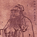
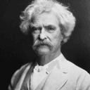
md · an attribution
lg · a header
- Benjamin Franklin
- Confucius
- Mark Twain
centred, ringed in the page's border
the demo above, verbatim
import { readFileSync } from "node:fs"
import { join } from "node:path"
import { Sample } from "@/app/samples"
import { toneFrom } from "@/registry/base-nova/lib/quote-card"
import { Avatar, type AvatarSize } from "@/registry/base-nova/ui/avatar"

// #region people
/** The same three portraits the quote demo uses, read the same way: `public/<name>.json`
 *  beside `public/<name>.png`, written once by `mise portrait` on a machine with Vision
 *  and sips. This page decodes no pixel. */
function face(png: string, name: string) {
  const json = join(process.cwd(), "public", png.replace(/\.[^.]+$/, ".json"))
  const { focus, average } = JSON.parse(readFileSync(json, "utf8")) as {
    focus: number
    average: [number, number, number]
  }
  return { src: png, alt: name, focus, tone: toneFrom(...average) }
}

const PEOPLE = [
  face("/benjamin-franklin.png", "Benjamin Franklin"),
  face("/confucius.png", "Confucius"),
  face("/mark-twain.png", "Mark Twain"),
]
// #endregion

const SIZES: readonly [AvatarSize, string][] = [
  ["sm", "a feed line, a comment"],
  ["md", "an attribution"],
  ["lg", "a header"],
]

export default function Demo() {
  return (
    <div className="space-y-8">
      <Sample
        name="sizes"
        title="three rungs"
        description="each positioned on its subject from the sidecar's focus and ringed in its own average colour; a face that opens its portrait is avatar-portrait"
        with="people"
      >
        <div className="space-y-6">
          {SIZES.map(([size, where]) => (
            <div key={size} className="space-y-2">
              <div className="font-mono text-muted-foreground text-xs">
                {size} · {where}
              </div>
              <div className="flex items-center gap-4">
                {PEOPLE.map((p) => (
                  <Avatar key={p.src} {...p} size={size} />
                ))}
              </div>
            </div>
          ))}
        </div>
      </Sample>
      <Sample name="attribution" glance title="beside a name" with="people">
        <ul className="space-y-2 text-sm">
          {PEOPLE.map((p) => (
            <li key={p.src} className="flex items-center gap-3">
              <Avatar {...p} size="md" />
              {p.alt}
            </li>
          ))}
        </ul>
      </Sample>
      <Sample
        name="no-sidecar"
        title="without a sidecar"
        description="centred, ringed in the page's border"
      >
        <Avatar src="/mark-twain.png" alt="Mark Twain" size="md" />
      </Sample>
    </div>
  )
}
the source, every file an install writes
// A PERSON'S FACE, the same object everywhere it appears: beside a quotation, at the head
// of their page, in a feed card, on a comment, in a picker. One round crop, sized on the
// studio's scale, positioned on the subject rather than on the middle of the file, ringed
// in the picture's own colour.
//
// It reads the same two facts the quote card reads from a portrait's sidecar: `focus`,
// where the subject sits across the picture, and the tone the average colour gives. A
// face cropped on the centre of a file that had its subject to one side is how a
// thumbnail ends up showing an ear; `object-position` from the focus is how it does not.
//
// A face that opens its full portrait is `avatar-portrait` (it brings the lightbox): a
// face alone installs nothing else, so a picker or a chat that only shows faces never
// carries a viewer it does not use. Both draw through `avatarLook` and `AvatarImage`,
// one look for the two.
//
// STYLE IS UTILITIES, the way every shadcn item is, so a consumer overrides with
// `className` and never fights a stylesheet. The two numbers that are not a fixed value,
// the rung and the focus, arrive as custom properties and land through `size-(--…)` and
// `object-(--…)`; the class says which property each one drives.

import type * as React from "react"
import { cn } from "@/lib/utils"
import { Image } from "@/registry/base-nova/ui/image"

export type AvatarSize = "sm" | "md" | "lg"

export interface AvatarProps {
  /** The rendition the page paints. */
  src: string
  /** The person's name: the accessible name of the picture. */
  alt: string
  /** On the studio's rungs: 24, 40, 64 px. */
  size?: AvatarSize
  /** Where the subject sits across the picture, 0 to 1: the sidecar's number. */
  focus?: number
  /** The picture's own colour, for the hairline ring. */
  tone?: { accent: string } | null
  className?: string
}

/** Rungs of the 8·2ⁿ scale, in rem: a comment or a feed line, an attribution, a header. */
export const AVATAR_SIZES: Record<AvatarSize, string> = {
  sm: "1.5rem",
  md: "2.5rem",
  lg: "4rem",
}

/** A HAIRLINE IN THE PICTURE'S OWN COLOUR. On a dark ground a dark portrait has no edge;
 *  the ring gives it one, and taking the colour from the picture keeps it belonging to the
 *  picture rather than to the page. Without a tone it is the page's border. */
const RING = "ring-1 ring-(--ag-avatar-ink)/40"
const RING_PLAIN = "ring-1 ring-border/40"

/** The face's frame, as classes and custom properties: what an avatar and a portrait
 *  that opens wear alike. */
export function avatarLook({
  size = "md",
  focus = 0.5,
  tone,
  className,
}: Pick<AvatarProps, "size" | "focus" | "tone" | "className">): {
  className: string
  style: React.CSSProperties
} {
  return {
    className: cn(
      "inline-block flex-none size-(--ag-avatar-size) overflow-hidden rounded-full align-middle",
      tone ? RING : RING_PLAIN,
      className,
    ),
    style: {
      "--ag-avatar-size": AVATAR_SIZES[size],
      // The whole object-position, so the class consumes one value.
      "--ag-avatar-focus": `${(focus * 100).toFixed(1)}% 50%`,
      ...(tone ? { "--ag-avatar-ink": tone.accent } : {}),
    } as React.CSSProperties,
  }
}

/** The picture itself, POSITIONED ON THE SUBJECT, not on the middle of the file. Named
 *  by `alt` on its own; inside a control that carries the name, pass `alt=""`. */
export function AvatarImage({ src, alt }: { src: string; alt: string }) {
  return (
    <Image
      data-slot="avatar-image"
      className="block size-full object-cover object-(--ag-avatar-focus)"
      src={src}
      alt={alt}
      width={64}
      height={64}
      loading="lazy"
    />
  )
}

export function Avatar({ src, alt, ...look }: AvatarProps) {
  const { className, style } = avatarLook(look)
  return (
    <span data-slot="avatar" className={className} style={style}>
      <AvatarImage src={src} alt={alt} />
    </span>
  )
}