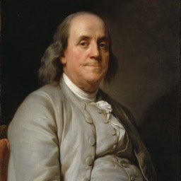
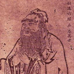
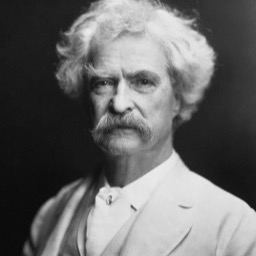
an avatar that opens the full portrait in a lightbox of its own
npx shadcn add @ag/avatar-portraitAlready installed? Preview an update
npx shadcn add @ag/avatar-portrait --dry-runYour installed source stays unchanged until you update it. How updates work
Latest changes · 2026-10-11
- New: a face worth a closer look, the avatar that opens the full portrait alone in a lightbox of its own, captioned with the person's name (what
Avatar'sfulldid). It brings the lightbox;quoteuses it for an author with a portrait.
each opens its portrait alone, one viewer per face, never a reel of every face on the page

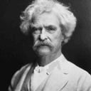
the demo above, verbatim
import { readFileSync } from "node:fs"
import { join } from "node:path"
import { Sample } from "@/app/samples"
import { toneFrom } from "@/registry/base-nova/lib/quote-card"
import { AvatarPortrait } from "@/registry/base-nova/ui/avatar-portrait"

// #region people
/** A portrait's sidecar (`public/<name>.json`, written by `mise portrait`): where the
 *  subject sits, its average colour and the original's size, the one worth opening. */
function portrait(png: string, name: string) {
  const json = join(process.cwd(), "public", png.replace(/\.[^.]+$/, ".json"))
  const { focus, average, size } = JSON.parse(readFileSync(json, "utf8")) as {
    focus: number
    average: [number, number, number]
    size: [number, number]
  }
  return {
    src: png,
    alt: name,
    focus,
    tone: toneFrom(...average),
    full: { src: png, width: size[0], height: size[1] },
  }
}

const PEOPLE = [
  portrait("/benjamin-franklin.png", "Benjamin Franklin"),
  portrait("/confucius.png", "Confucius"),
  portrait("/mark-twain.png", "Mark Twain"),
]
// #endregion

export default function Demo() {
  return (
    <div className="space-y-8">
      <Sample
        name="opens"
        glance
        title="a face that opens"
        description="each opens its portrait alone, one viewer per face, never a reel of every face on the page"
        with="people"
      >
        <div className="flex items-center gap-4">
          {PEOPLE.map((p) => (
            <AvatarPortrait key={p.src} {...p} size="lg" />
          ))}
        </div>
      </Sample>
    </div>
  )
}
the source, every file an install writes
"use client"

// A CLIENT COMPONENT, because it hands the lightbox a `render` element. An element
// created in a server component and passed as a prop across the boundary arrives without
// its props during prerender (`element.props` is undefined and the trigger's own assert
// throws), so the element has to be made on the same side as the trigger that clones it.
//
// A FACE WORTH A CLOSER LOOK: the avatar (the same look, `avatarLook`), and a press opens
// the full portrait ALONE (`LightboxSolo`: its own provider, so three faces on a page are
// three viewers, never a reel with a strip and arrows), with the person's name as the
// caption (the lightbox's figcaption fallback would read a quote's whole attribution).
// Needs nothing above it. The lightbox's code loads only once a face is on the page (a
// lazy import, the plain face standing in until it has). A face that never opens is
// `avatar`, which installs nothing else.

import * as React from "react"
import {
  AvatarImage,
  type AvatarProps,
  avatarLook,
} from "@/registry/base-nova/ui/avatar"
import type { Entry } from "@/registry/base-nova/ui/lightbox"

const LightboxSolo = React.lazy(() =>
  import("@/registry/base-nova/ui/lightbox").then((m) => ({
    default: m.LightboxSolo,
  })),
)

export interface AvatarPortraitProps extends AvatarProps {
  /** The original, worth opening: the avatar opens it, alone. */
  full: { src: string; width: number; height: number }
}

export function AvatarPortrait({
  src,
  alt,
  full,
  ...look
}: AvatarPortraitProps) {
  const { className, style } = avatarLook({
    ...look,
    className: `cursor-zoom-in ${look.className ?? ""}`,
  })
  const plain = (
    <span data-slot="avatar" className={className} style={style}>
      <AvatarImage src={src} alt={alt} />
    </span>
  )
  const entry: Entry = {
    id: `avatar:${full.src}`,
    media: {
      kind: "image",
      source: { src, full: full.src, width: full.width, height: full.height },
      alt,
    },
    caption: alt,
  }
  return (
    <React.Suspense fallback={plain}>
      <LightboxSolo
        entry={entry}
        label="portrait"
        render={
          <a
            data-slot="avatar"
            href={full.src}
            className={className}
            style={style}
            aria-label={alt}
          />
        }
      >
        {/* Decorative inside the trigger: the trigger carries the name. */}
        <AvatarImage src={src} alt="" />
      </LightboxSolo>
    </React.Suspense>
  )
}