the glass collection: the glass material and a gliding highlight
npx shadcn add @ag/liquid-glassAlready installed? Preview an update
npx shadcn add @ag/liquid-glass --dry-runYour installed source stays unchanged until you update it. How updates work
Latest changes · 2026-10-14
GlassPaneis removed: a glass container is<Panel material="glass">. Migration:front={…}ishead={…}(frontAt="bottom":foot={…}),frontHeightisheadHeightorfootHeight,--glass-pane-front-heightis--panel-heador--panel-foot,frontClassNameisheadClassNameorfootClassName;radius,backColor,frontColor,spill,tint,tintAmountandrimkeep their names. The panel pads what it holds (bodyClassName="p-0"for none).GlassSpillis re-exported.
the demo above, verbatim
"use client"
import "@/registry/base-nova/ui/edge-fade"
import {
ArrowLeft,
ArrowRight,
Check,
ChevronDown,
ChevronLeft,
LogOut,
Pause,
Play,
} from "lucide-react"
import * as React from "react"
import { siGithub, siGoogle, siTelegram } from "simple-icons"
import * as z from "zod"
import { Sample } from "@/app/samples"
import { cn } from "@/lib/utils"
import { AvatarPortrait } from "@/registry/base-nova/ui/avatar-portrait"
import {
AdaptiveGlass,
Backdrop,
BackdropGroup,
useBackdropSource,
} from "@/registry/base-nova/ui/backdrop"
import { Badge } from "@/registry/base-nova/ui/badge"
import { Button } from "@/registry/base-nova/ui/button"
import {
Dialog,
DialogContent,
DialogDescription,
DialogHeader,
DialogSection,
DialogTitle,
DialogTrigger,
} from "@/registry/base-nova/ui/dialog"
import { Field, fieldRow } from "@/registry/base-nova/ui/field"
import { Form, FormSubmit, useForm } from "@/registry/base-nova/ui/form"
import { GlassGlide } from "@/registry/base-nova/ui/glass-glide"
import { Input } from "@/registry/base-nova/ui/input"
import {
BackdropScope,
MaterialProvider,
type Scheme,
} from "@/registry/base-nova/ui/material"
import {
Glass,
type GlassStyle,
type WornScheme,
} from "@/registry/base-nova/ui/material-glass"
import {
DropdownMenu,
DropdownMenuContent,
DropdownMenuItem,
DropdownMenuLabel,
DropdownMenuSeparator,
DropdownMenuTrigger,
} from "@/registry/base-nova/ui/menu"
import { Panel } from "@/registry/base-nova/ui/panel"
import { Slider } from "@/registry/base-nova/ui/slider"
import {
ToggleGroup,
ToggleGroupItem,
} from "@/registry/base-nova/ui/toggle-group"
// #region photos
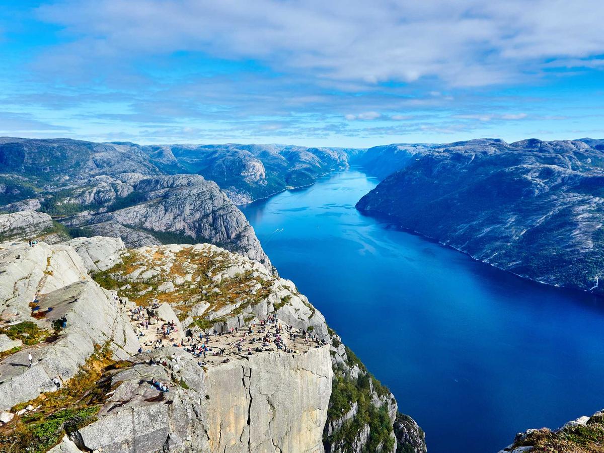
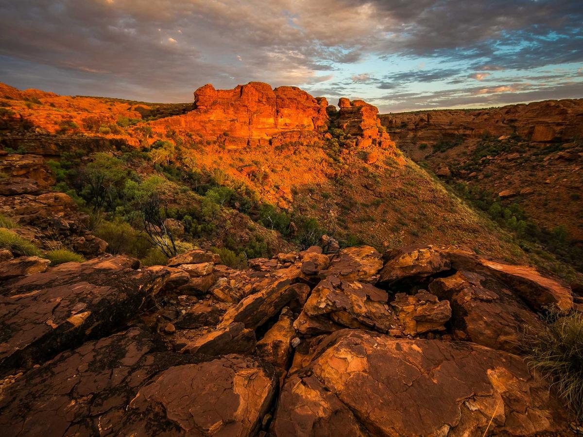
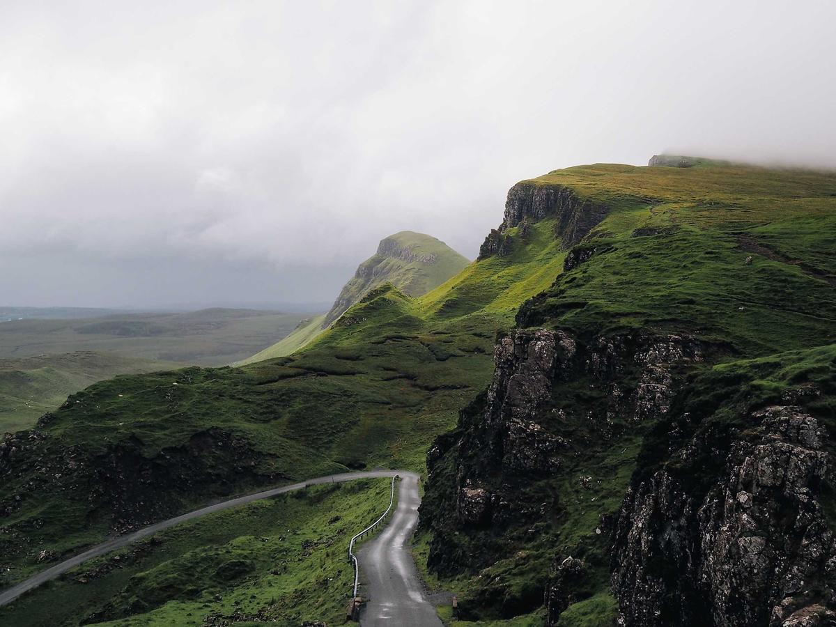
// Local copies of the river, mountains and valley photographs (Lorem Picsum).
const PHOTOS = [
{
src: "/glass-river.jpg",
name: "Along the river",
note: "The long way home.",
alt: "A river winding between forested mountains",
},
{
src: "/glass-mountains.jpg",
name: "Last light",
note: "A little longer before sunset.",
alt: "Orange canyon cliffs in the evening sun",
},
{
src: "/glass-valley.jpg",
name: "No hurry",
note: "One more stop before we go.",
alt: "A green valley beneath distant mountains",
},
] as const
// #endregion
// #region gallery
// The glass over the photographs: dark, light, or read by the photograph under each
// piece as they glide past (`backdrop`: the photographs are its source, a piece over
// two of them mid-glide is read across both).
const GALLERY_SCHEMES = [
{ value: "backdrop", label: "adaptive" },
{ value: "fluid", label: "fluid" },
{ value: "dark", label: "dark" },
{ value: "light", label: "light" },
] as const
type GalleryScheme = (typeof GALLERY_SCHEMES)[number]["value"]
export function Gallery({ initial = "backdrop" }: { initial?: GalleryScheme }) {
const [tone, setTone] = React.useState<GalleryScheme>(initial)
const viewport = React.useRef<HTMLElement>(null)
const [active, setActive] = React.useState(0)
const [playing, setPlaying] = React.useState(false)
const [saved, setSaved] = React.useState(false)
const [pictures, setPictures] = React.useState<HTMLImageElement[]>([])
const picture = (el: HTMLImageElement | null) => {
if (el) setPictures((p) => (p.includes(el) ? p : [...p, el]))
}
const source = useBackdropSource(pictures, { fit: "cover" })
// Fluid: each piece is the photograph under it, frosted and pushed light or dark
// along its own shapes, its words blended against it (the face's ring stays a
// ring: a blend would invert the face).
const fluid = tone === "fluid"
const go = React.useCallback((index: number) => {
const el = viewport.current
if (!el) return
const reduced = window.matchMedia(
"(prefers-reduced-motion: reduce)",
).matches
el.scrollTo({
left: index * el.clientWidth,
behavior: reduced ? "instant" : "smooth",
})
}, [])
React.useEffect(() => {
const motion = window.matchMedia("(prefers-reduced-motion: reduce)")
setPlaying(!motion.matches)
const change = () => setPlaying(!motion.matches)
motion.addEventListener("change", change)
return () => motion.removeEventListener("change", change)
}, [])
React.useEffect(() => {
if (!playing) return
const el = viewport.current
if (!el) return
let visible = false
let frame = 0
let last = 0
let index = Math.round(el.scrollLeft / el.clientWidth)
let direction = index === PHOTOS.length - 1 ? -1 : 1
let elapsed = 0
const reduced = window.matchMedia(
"(prefers-reduced-motion: reduce)",
).matches
const observer = new IntersectionObserver(
([entry]) => {
visible = Boolean(entry?.isIntersecting)
},
{ threshold: 0.25 },
)
observer.observe(el)
// Hold a complete photograph, then glide to its neighbour. Reverse at the
// ends instead of jumping back to the first photograph.
const tick = (now: number) => {
const dt = last ? Math.min(now - last, 64) : 0
last = now
if (visible && !document.hidden) {
elapsed += dt
const t = Math.min(1, Math.max(0, (elapsed - 2400) / 1600))
const eased = reduced
? t === 1
? 1
: 0
: t * t * t * (t * (t * 6 - 15) + 10)
el.scrollLeft = (index + direction * eased) * el.clientWidth
if (t === 1) {
index += direction
if (index === 0 || index === PHOTOS.length - 1) direction *= -1
elapsed = 0
}
}
frame = requestAnimationFrame(tick)
}
frame = requestAnimationFrame(tick)
return () => {
observer.disconnect()
cancelAnimationFrame(frame)
}
}, [playing])
const stop = () => setPlaying(false)
const photo = PHOTOS[active] ?? PHOTOS[0]
return (
<div className="space-y-3">
<div
data-gallery={tone}
className="relative isolate overflow-hidden rounded-[2rem] bg-zinc-900 [--scene-height:32rem] sm:[--scene-height:36rem]"
>
<section
ref={viewport}
data-playing={playing}
// biome-ignore lint/a11y/noNoninteractiveTabindex: keyboard users must be able to scroll this overflow region
tabIndex={0}
aria-label={`${tone} glass photo gallery`}
// edge: one photo a view, snapped, run to the frame's edges: its sides
// are the frame's, never a cut through a picture.
className="flex h-(--scene-height) snap-x snap-mandatory data-[playing=true]:snap-none overflow-x-auto overflow-y-hidden overscroll-x-contain [scrollbar-width:none] focus-visible:outline-2 focus-visible:-outline-offset-4 focus-visible:outline-white [&::-webkit-scrollbar]:hidden"
onWheel={stop}
onTouchStart={stop}
onKeyDown={stop}
onScroll={(event) => {
const el = event.currentTarget
setActive(
Math.min(
PHOTOS.length - 1,
Math.max(0, Math.round(el.scrollLeft / el.clientWidth)),
),
)
}}
>
{PHOTOS.map((item, index) => (
<div
key={item.src}
className="relative h-(--scene-height) w-full shrink-0 snap-start"
>
{/* biome-ignore lint/performance/noImgElement: portable demo assets, served locally */}
<img
ref={picture}
src={item.src}
alt={item.alt}
width={1200}
height={900}
loading={index === 0 ? "eager" : "lazy"}
className="absolute inset-0 size-full object-cover"
/>
{/* The shade the title is read on, behind it alone: it fades out
before the controls, which stand on the photograph itself (and
are read by it, adaptive). */}
<div
className="absolute inset-x-0 bottom-0 h-3/5 bg-linear-to-t from-transparent from-10% via-black/55 via-50% to-transparent"
aria-hidden
/>
<div className="absolute right-6 bottom-28 left-6 text-white [text-shadow:0_1px_8px_rgb(0_0_0/0.4)] sm:right-10 sm:bottom-32 sm:left-10">
<p className="mb-2 text-xs tracking-[0.16em] uppercase opacity-75">
Weekend away · 0{index + 1}
</p>
<p className="text-3xl font-medium tracking-tight sm:text-5xl">
{item.name}
</p>
<p className="mt-2 text-sm opacity-80">{item.note}</p>
</div>
</div>
))}
</section>
<BackdropScope source={source}>
<MaterialProvider scheme={tone === "fluid" ? "backdrop" : tone}>
{/* Each row reads the photograph as one (the band under it), so its
pieces always agree. */}
<BackdropGroup className="pointer-events-none absolute inset-x-4 top-4 flex items-center gap-3 sm:inset-x-6 sm:top-6">
<AdaptiveGlass
fluid={fluid}
as="button"
shape="circle"
className="pointer-events-auto [--glass-size:3rem] sm:[--glass-size:3.5rem]"
aria-label="Back to first photo"
onClick={() => {
stop()
go(0)
}}
>
<ChevronLeft className="size-6 -translate-x-0.5" />
</AdaptiveGlass>
<AdaptiveGlass
fluid={fluid}
shape="pill"
className="mx-auto min-w-0 flex-1 flex-col justify-center gap-0 px-3 py-1 text-center [--glass-size:3rem] sm:max-w-64 sm:px-6 sm:[--glass-size:3.5rem]"
>
<span className="text-sm font-semibold leading-5 sm:text-base">
Adrian
</span>
<span className="truncate text-xs leading-4">online</span>
</AdaptiveGlass>
{/* The face opens the portrait alone, in the lightbox. */}
<AdaptiveGlass
shape="circle"
className="pointer-events-auto p-1 [--glass-size:3rem] sm:[--glass-size:3.5rem]"
>
<AvatarPortrait
src="/adriangalilea.jpg"
alt="Adrian"
full={{ src: "/adriangalilea.jpg", width: 192, height: 192 }}
className="size-full ring-0"
/>
</AdaptiveGlass>
</BackdropGroup>
<BackdropGroup className="pointer-events-none absolute inset-x-4 bottom-4 flex items-center gap-3 sm:inset-x-6 sm:bottom-6">
<AdaptiveGlass
fluid={fluid}
as="button"
shape="circle"
className="pointer-events-auto [--glass-size:3rem] sm:[--glass-size:3.5rem]"
aria-label="Previous photo"
disabled={active === 0}
onClick={() => {
stop()
go(active - 1)
}}
>
<ArrowLeft className="size-5" />
</AdaptiveGlass>
<AdaptiveGlass
fluid={fluid}
shape="bar"
className="pointer-events-auto mx-auto min-w-0 flex-1 justify-between px-3 [--glass-size:3rem] sm:max-w-64 sm:px-4 sm:[--glass-size:3.5rem]"
>
<span className="text-sm tabular-nums">
0{active + 1} <span className="opacity-45">/ 03</span>
</span>
<button
type="button"
aria-label={playing ? "Pause slideshow" : "Play slideshow"}
aria-pressed={playing}
onClick={() => setPlaying(!playing)}
className="grid size-9 place-items-center rounded-full hover:bg-current/10 focus-visible:outline-2 focus-visible:outline-offset-2"
>
{playing ? (
<Pause className="size-4" />
) : (
<Play className="size-4" />
)}
</button>
<button
type="button"
aria-label={saved ? "Unsave album" : "Save album"}
aria-pressed={saved}
onClick={() => setSaved(!saved)}
className="rounded-full px-2 py-2 text-xs font-medium hover:bg-current/10 focus-visible:outline-2 focus-visible:outline-offset-2"
>
{saved ? <Check className="size-4" /> : "Save"}
</button>
</AdaptiveGlass>
<AdaptiveGlass
fluid={fluid}
as="button"
shape="circle"
className="pointer-events-auto [--glass-size:3rem] sm:[--glass-size:3.5rem]"
aria-label="Next photo"
disabled={active === PHOTOS.length - 1}
onClick={() => {
stop()
go(active + 1)
}}
>
<ArrowRight className="size-5" />
</AdaptiveGlass>
</BackdropGroup>
</MaterialProvider>
</BackdropScope>
</div>
<div className="flex flex-wrap items-center justify-between gap-2 text-xs text-muted-foreground">
<ToggleGroup
size="sm"
aria-label="the glass"
value={tone}
onValueChange={(v) => setTone(v as GalleryScheme)}
>
{GALLERY_SCHEMES.map((s) => (
<ToggleGroupItem key={s.value} value={s.value}>
{s.label}
</ToggleGroupItem>
))}
</ToggleGroup>
<span role="status" aria-live={playing ? "off" : "polite"}>
{photo.name} · {active + 1} of {PHOTOS.length}
</span>
</div>
</div>
)
}
// #endregion
// #region composition
// The material and the scheme are a THEME, set once round everything they reach, the
// way a page is dark or light: one MaterialProvider, and the panel, the field, the
// input and both buttons inside it are glass in that scheme with no prop of their
// own. A prop on one control overrides it there and nowhere else.
function Composition() {
const input = React.useRef<HTMLInputElement>(null)
const [scheme, setScheme] = React.useState<WornScheme>("auto")
return (
<div className="space-y-6">
<ToggleGroup
size="sm"
aria-label="scheme"
value={scheme}
onValueChange={(v) => setScheme(v as WornScheme)}
>
{(["auto", "light", "dark"] as const).map((value) => (
<ToggleGroupItem key={value} value={value}>
{value}
</ToggleGroupItem>
))}
</ToggleGroup>
<div className="relative overflow-hidden rounded-3xl bg-[url(/glass-valley.jpg)] bg-cover bg-center p-6 sm:p-10">
<MaterialProvider material="glass" scheme={scheme}>
<Panel
title="make it yours"
description="native elements, normal props, refs, and tailwind overrides"
className="max-w-sm"
>
<div className="space-y-4">
<Field label="album name">
{(wiring) => (
<Input {...wiring} ref={input} defaultValue="weekend away" />
)}
</Field>
<div className="flex flex-wrap items-center gap-2">
<Button onClick={() => input.current?.focus()}>rename</Button>
<Button variant="secondary" disabled>
shared
</Button>
</div>
</div>
</Panel>
</MaterialProvider>
</div>
</div>
)
}
// #endregion
// #region tint
// One thing varies: the colour the glass is stained with, at the default amount.
// The same card on the same photograph, so the stain is all that changes.
const TINTS = [
{ name: "none", tint: undefined },
{ name: "sage", tint: "oklch(72% 0.09 150)" },
{ name: "ember", tint: "oklch(70% 0.16 50)" },
{ name: "ice", tint: "oklch(72% 0.1 240)" },
{ name: "violet", tint: "oklch(66% 0.16 300)" },
] as const
// Every knob a glass has, live: its scheme, how much of the tint goes in, how bright
// and how thick its rim is, and how hard it frosts. Each is a prop or a custom
// property of the glass, the same ones every control's glass face reads.
function Tints() {
const [scheme, setScheme] = React.useState<Scheme>("backdrop")
const [groundShare, setGroundShare] = React.useState(0.35)
const [amount, setAmount] = React.useState(0.2)
const [rim, setRim] = React.useState(1)
const [rimWidth, setRimWidth] = React.useState(1)
const [blur, setBlur] = React.useState<number | null>(null)
const [onGlass, setOnGlass] = React.useState(0.65)
const percent = (v: number) => `${Math.round(v * 100)}%`
// The knobs every glass in the row reads, set once round them.
const knobs: GlassStyle = {
"--glass-on-glass": onGlass,
"--glass-ground-share": percent(groundShare),
}
return (
<div className="space-y-6">
<div className="grid gap-x-6 gap-y-4 sm:grid-cols-[auto_1fr_1fr]">
<ToggleGroup
size="sm"
aria-label="scheme"
value={scheme}
onValueChange={(v) => setScheme(v as Scheme)}
className="self-center"
>
{(["backdrop", "auto", "light", "dark"] as const).map((value) => (
<ToggleGroupItem key={value} value={value}>
{value}
</ToggleGroupItem>
))}
</ToggleGroup>
<Field label="tintAmount" aside={percent(amount)}>
<Slider
label="tintAmount"
value={amount}
onValueChange={setAmount}
max={0.5}
step={0.01}
format={percent}
/>
</Field>
<Field label="rim" aside={`${rim.toFixed(2)}×`}>
<Slider
label="rim"
value={rim}
onValueChange={setRim}
max={4}
step={0.05}
format={(v) => `${v.toFixed(2)}×`}
/>
</Field>
<Field label="--glass-on-glass" aside={`${onGlass.toFixed(2)}×`}>
<Slider
label="--glass-on-glass"
value={onGlass}
onValueChange={setOnGlass}
max={1}
step={0.05}
format={(v) => `${v.toFixed(2)}×`}
/>
</Field>
<Field label="rimWidth" aside={`${rimWidth}px`}>
<Slider
label="rimWidth"
value={rimWidth}
onValueChange={setRimWidth}
min={0.5}
max={2}
step={0.25}
format={(v) => `${v}px`}
/>
</Field>
<Field
label="--glass-blur"
aside={blur === null ? "the face's own" : `${blur}px`}
>
<Slider
label="--glass-blur"
value={blur ?? 14}
onValueChange={setBlur}
max={32}
step={1}
format={(v) => `${v}px`}
/>
</Field>
<Field
label="--glass-ground-share"
aside={scheme === "backdrop" ? percent(groundShare) : "backdrop only"}
>
<Slider
label="--glass-ground-share"
value={groundShare}
onValueChange={setGroundShare}
max={1}
step={0.05}
format={percent}
/>
</Field>
</div>
<Backdrop
src="/glass-river.jpg"
className="grid gap-4 rounded-3xl p-6 sm:grid-cols-5 sm:p-8"
>
<div className="contents" style={knobs}>
{/* The cards are one row, read as one (BackdropGroup): one card alone
over brighter rock turned light beside four dark ones. */}
<BackdropGroup
scheme={scheme}
className="grid gap-4 sm:col-span-5 sm:grid-cols-5"
>
{TINTS.map(({ name, tint }) => (
<AdaptiveGlass
key={name}
tint={tint}
tintAmount={amount}
rim={rim}
rimWidth={`${rimWidth}px`}
style={
blur === null ? undefined : { "--glass-blur": `${blur}px` }
}
className="space-y-1 p-4"
>
<p className="text-sm font-semibold">{name}</p>
<p className="text-xs opacity-70">
{tint ? `tint · ${percent(amount)}` : "the face alone"}
</p>
</AdaptiveGlass>
))}
</BackdropGroup>
{/* Glass on glass: the field, the button and the badges stand on the
panel's glass, and carry --glass-on-glass of their tint and
--glass-on-glass-rim of their edge. */}
<MaterialProvider material="glass" scheme={scheme}>
<Panel
title="glass on glass"
description="a field, a button and a badge on a glass panel"
className="sm:col-span-5"
>
<div className="flex flex-wrap items-center gap-3">
<Input placeholder="a field" className="w-56" />
<Button>a button</Button>
<Badge>a badge</Badge>
<Badge variant="success">
<Check /> shipped
</Badge>
</div>
</Panel>
</MaterialProvider>
</div>
</Backdrop>
</div>
)
}
// #endregion
// #region pane
// A glass panel's two surfaces. Above: its head across the top naming the
// columns, in a lighter colour than the back, the list scrolling beneath it
// (the panel's body starts below the head and passes under it, blurred). Below:
// cards with a foot, clear, so it is told only by its hairline and its blur; each
// card given one tint and nothing else, its edge and both surfaces following.
const ROWS = [
"Watch folders",
"Smart collections",
"Keyboard everywhere",
"Faster thumbnails",
"Import from Photos",
"Shared libraries",
"Offline mode",
"Batch rename",
] as const
const CARDS = [
{ kind: "feat", tint: "oklch(72% 0.09 150)", title: "Watch folders" },
{ kind: "fix", tint: "oklch(80% 0.15 80)", title: "Thumbnails flicker" },
{ kind: "idea", tint: "oklch(72% 0.1 240)", title: "Shared libraries" },
] as const
function Panes() {
return (
<div className="space-y-6 rounded-3xl bg-[url(/glass-mountains.jpg)] bg-cover bg-center p-6 text-white sm:p-8">
{/* Scrolls under the panel's head, which blurs it, the panel's edge
spilling it where it ends. */}
<Panel
material="glass"
radius="1rem"
maxHeight="18rem"
backColor="rgb(16 16 18 / 0.6)"
frontColor="rgb(56 56 62 / 0.18)"
bodyClassName="grid grid-cols-2 gap-3 pt-3"
head={
<div className="grid w-full grid-cols-2 font-mono text-xs">
<span>planned</span>
<span className="pl-1.5">building</span>
</div>
}
>
{ROWS.map((row) => (
<Glass key={row} className="p-3 text-sm">
{row}
</Glass>
))}
</Panel>
<div className="grid gap-4 sm:grid-cols-3">
{CARDS.map(({ kind, tint, title }) => (
<Panel
key={title}
material="glass"
tint={tint}
tintAmount={0.06}
radius="0.75rem"
footHeight="2.75rem"
frontColor="transparent"
bodyClassName="gap-2 p-4"
footClassName="justify-between px-4 font-mono text-xs opacity-70"
foot={
<>
<span>anonymous</span>
<span>↑ 12</span>
</>
}
>
<p className="font-mono text-[10px] text-(--glass-rim-ink)">
{kind}
</p>
<p className="text-sm font-semibold">{title}</p>
</Panel>
))}
</div>
</div>
)
}
// #endregion
// #region controls
const SIGNUP = z.object({
name: z.string().trim().min(2, "a name, at least two letters"),
handle: z
.string()
.regex(/^[a-z0-9-]{3,20}$/, "3 to 20: lowercase, digits and -"),
email: z.email("that doesn't look like an email"),
})
// The base controls in their glass material, over a photograph the glass READS
// (<Backdrop>): each panel takes its scheme, its thickness, its rim's strength and
// the colour its rim catches from the part of the picture under it, and what is
// inside a panel stands on the panel's glass. One MaterialProvider round them all.
// Buttons at three sizes and as an icon, a link that is one, a toggle (its state
// the page's), a segmented choice whose highlight glides, badges, a dropdown and a
// form.
function Controls() {
const [following, setFollowing] = React.useState(false)
const [mode, setMode] = React.useState<"chill" | "apple" | "quiet">("chill")
return (
<MaterialProvider material="glass">
<Backdrop
src="/glass-mountains.jpg"
className="grid gap-4 rounded-3xl p-4 sm:grid-cols-2 sm:p-8"
>
<Panel
title="buttons"
description="three sizes, an icon, soft corners, and a link that is one"
className="sm:col-span-2"
>
<div className="flex flex-wrap items-center gap-3">
<Button size="sm">Small</Button>
<Button>Medium</Button>
<Button size="lg">Large</Button>
<Button size="icon-lg" aria-label="back">
<ChevronLeft />
</Button>
<Button size="lg" corners="soft">
Soft corners
</Button>
<Button size="lg" render={<a href="#controls" />}>
A link <ArrowRight />
</Button>
</div>
</Panel>
<Panel
title="choices"
description="a toggle, and a segmented choice whose highlight glides"
>
<div className="flex flex-wrap items-center gap-3">
<Button
size="lg"
pressed={following}
onClick={() => setFollowing(!following)}
on={
<>
<Check /> following
</>
}
off={
<>
<Play /> follow
</>
}
/>
<ToggleGroup
size="lg"
aria-label="fan mode"
value={mode}
onValueChange={(v) => setMode(v as typeof mode)}
>
<ToggleGroupItem value="chill">chill</ToggleGroupItem>
<ToggleGroupItem value="apple">apple</ToggleGroupItem>
<ToggleGroupItem value="quiet">quiet</ToggleGroupItem>
</ToggleGroup>
</div>
</Panel>
<Panel
title="badges"
description="small labels of glass: a stack, a status stained its colour, a link"
>
<div className="flex flex-wrap items-center gap-2">
<Badge>swift</Badge>
<Badge>swiftui</Badge>
<Badge>appkit</Badge>
<Badge variant="success">
<Check /> shipped
</Badge>
<Badge render={<a href="#controls" />}>
v1.2.0 <ArrowRight />
</Badge>
</div>
</Panel>
<Panel
title="menu"
description="a dropdown: sign in, then the account and the way out"
>
<div>
<SessionMenu />
</div>
</Panel>
<Panel
title="fields"
description="a sign-up judged by one zod schema in the form, its inputs and its labels glass; each field speaks once you leave it, or when the form is sent"
className="sm:col-span-2"
>
<SignUp />
</Panel>
</Backdrop>
</MaterialProvider>
)
}
// A sign-up judged by ONE schema, the one a server would parse too: the form, every
// part of it glass (MaterialProvider), the inputs keeping their own attributes for
// the keyboard and autofill.
function SignUp() {
const form = useForm<z.infer<typeof SIGNUP>>({
initial: { name: "", handle: "", email: "" },
schema: SIGNUP,
onSubmit: async () => {},
})
return (
<MaterialProvider material="glass">
<Form
form={form}
guard={false}
className={cn(
"grid gap-x-3 gap-y-3 sm:grid-cols-[1fr_1fr_1fr_auto] sm:gap-y-0",
fieldRow,
)}
>
<form.Field name="name" label="your name">
{(c) => <Input {...c.input} size="lg" autoComplete="name" />}
</form.Field>
<form.Field name="handle" label="a handle">
{(c) => <Input {...c.input} size="lg" autoComplete="username" />}
</form.Field>
<form.Field name="email" label="your email">
{(c) => (
<Input {...c.input} size="lg" type="email" autoComplete="email" />
)}
</form.Field>
<FormSubmit
size="icon-lg"
keys={false}
aria-label="confirm"
className="self-end"
>
<ArrowRight />
</FormSubmit>
</Form>
</MaterialProvider>
)
}
// A sign-in control: out, the menu offers the ways in; in, it shows who you are
// and the way out. The trigger is a soft glass button, the menu its own corners.
const PROVIDERS = { github: siGithub, google: siGoogle, telegram: siTelegram }
function Brand({ icon }: { icon: { path: string } }) {
return (
<svg viewBox="0 0 24 24" aria-hidden className="fill-current">
<path d={icon.path} />
</svg>
)
}
function SessionMenu() {
const [user, setUser] = React.useState<string | null>(null)
return (
<DropdownMenu>
<DropdownMenuTrigger
render={
<Button size="md" corners="soft" className="group font-normal" />
}
>
{user ? (
<>
<span className="grid size-5 place-items-center rounded-[6px] bg-white/15 text-[10px]">
{user[0]}
</span>
{user}
</>
) : (
"sign in"
)}
<ChevronDown className="size-3 transition-transform group-data-[popup-open]:rotate-180" />
</DropdownMenuTrigger>
<DropdownMenuContent material="glass">
{user ? (
<>
<DropdownMenuLabel>signed in with {user}</DropdownMenuLabel>
<DropdownMenuSeparator />
<DropdownMenuItem destructive onClick={() => setUser(null)}>
<LogOut /> sign out
</DropdownMenuItem>
</>
) : (
Object.entries(PROVIDERS).map(([name, icon]) => (
<DropdownMenuItem key={name} onClick={() => setUser(name)}>
<Brand icon={icon} /> {name}
</DropdownMenuItem>
))
)}
</DropdownMenuContent>
</DropdownMenu>
)
}
// #endregion
// #region glide
// One highlight gliding between a list's rows: a glass menu whose rows are
// neutral, and a list whose rows each wear their own tone (--glide-tone), the
// highlight blending from one to the next.
const TONED = [
{ name: "chill", tone: "oklch(72% 0.12 240)" },
{ name: "trash", tone: "oklch(78% 0.18 150)" },
{ name: "awake", tone: "oklch(78% 0.14 70)" },
]
function Glides() {
return (
<div className="grid gap-6 rounded-3xl bg-[url(/glass-river.jpg)] bg-cover bg-center p-6 text-white sm:grid-cols-2 sm:p-10">
<Glass
shape="surface"
className="p-1.5 [--glass-radius:--theme(--radius-2xl)]"
>
<GlassGlide>
{["github", "google", "telegram"].map((name) => (
<button
key={name}
type="button"
data-glide-item
className="relative flex w-full rounded-xl px-3 py-2 text-left font-mono text-sm outline-none"
>
{name}
</button>
))}
</GlassGlide>
</Glass>
<Glass
shape="surface"
className="p-1.5 [--glass-radius:--theme(--radius-2xl)]"
>
<GlassGlide strength={0.16}>
{TONED.map(({ name, tone }) => (
<button
key={name}
type="button"
data-glide-item
style={{ "--glide-tone": tone } as React.CSSProperties}
className="relative flex w-full rounded-xl px-3 py-2 text-left text-sm outline-none"
>
{name}
</button>
))}
</GlassGlide>
</Glass>
</div>
)
}
// #endregion
// #region dialog
function Dialogs() {
const [cut, setCut] = React.useState(0.7)
const [step, setStep] = React.useState(250)
return (
<div className="relative h-80 overflow-hidden rounded-2xl">
<img
src={PHOTOS[0].src}
alt={PHOTOS[0].alt}
className="absolute inset-0 size-full object-cover"
/>
<div className="absolute inset-0 grid place-items-center gap-3">
<Dialog place="side">
<DialogTrigger
render={
<Button material="glass" scheme="dark" size="lg" corners="soft" />
}
>
smile’s settings
</DialogTrigger>
<DialogContent material="glass">
<DialogHeader>
<DialogTitle>smile</DialogTitle>
<DialogDescription>
gemma · the page beside it stays live
</DialogDescription>
</DialogHeader>
<DialogSection title="where a moment starts">
<Slider
label="threshold"
value={cut}
onValueChange={setCut}
snap="near"
tone="oklch(0.74 0.19 350)"
marks={[0.25, 0.5, 0.75].map((v) => ({
value: v,
label: v.toFixed(2),
}))}
format={(v) => v.toFixed(2)}
/>
</DialogSection>
<DialogSection title="how often it reads">
<Slider
label="frames a second"
value={step}
onValueChange={setStep}
snap="marks"
marks={[2000, 1000, 500, 250, 125, 50].map((s) => ({
value: s,
label: `${1000 / s}/s`,
}))}
/>
</DialogSection>
</DialogContent>
</Dialog>
</div>
</div>
)
}
// #endregion
export default function Demo() {
return (
<div className="space-y-12">
<Sample
name="photographs"
with="photos gallery"
title="01 · over photographs"
description="photographs glide beneath the controls; adaptive, each piece of glass is read by the photograph under it as they pass, light over a bright sky and dark over the river, a piece over two of them read across both"
>
<Gallery />
</Sample>
<Sample
name="composition"
with="composition"
title="02 · composition"
description="theme, native props, refs, and disabled states"
>
<Composition />
</Sample>
<Sample
name="tint"
with="tint"
title="03 · tint"
description="the same glass stained a colour, every knob it has live"
>
<Tints />
</Sample>
<Sample
name="pane"
with="pane"
title="04 · pane"
description="two surfaces, each its own colour: the back the content lies on, the front it passes under"
>
<Panes />
</Sample>
<Sample
name="controls"
with="controls"
title="05 · controls"
description="buttons, a link, a toggle, a segmented choice, a menu and fields"
>
<Controls />
</Sample>
<Sample
name="glide"
glance="wide"
with="glide"
title="06 · glide"
description="one highlight gliding between a list's rows, neutral or toned"
>
<Glides />
</Sample>
<Sample
name="dialog"
with="photos dialog"
title="07 · dialog"
description="a side panel in glass, the picture live beside it"
>
<Dialogs />
</Sample>
<p className="max-w-prose text-sm text-muted-foreground">
Use <code>shape</code> and <code>scheme</code> for the defaults,{" "}
<code>as</code> for the element, and <code>className</code> for sizing.
Set <code>--glass-blur</code> or <code>--glass-tint</code> through
Tailwind or the typed <code>style</code> prop; <code>rim</code> (a
multiple of the default brightness) and <code>rimWidth</code> tune the
edge; <code>tint</code> stains it a colour (<code>tintAmount</code>, 0
to 1, how much), or set <code>--glass-stain</code> on a parent to stain
every glass inside. <code>shape="surface"</code> applies only the
material.
</p>
</div>
)
}the source, every file an install writes
// THE GLASS COLLECTION: what glass makes that no base control is, and nothing that
// needs media. The material itself (glassVariants, Glass, GlassEdge, its light) is
// the `material` item's (material-glass), re-exported here; every base control has its
// own glass face (`material="glass"`: a button, a badge, a panel, a field, a menu, a
// tooltip, the player's parts); a glass container is a `Panel material="glass"`, its
// head and foot the material's front surfaces; the floating display round media is
// `glass-display`. Here: the gliding highlight (glass-glide).
export {
  Glass,
  GlassEdge,
  GlassFront,
  type GlassFrontAt,
  type GlassLight,
  type GlassLook,
  type GlassProps,
  type GlassShape,
  GlassSpill,
  type GlassStyle,
  glassEdge,
  glassFront,
  glassLift,
  glassLight,
  glassLooks,
  glassShapes,
  glassStyle,
  glassVariants,
  schemeOf,
  type WornScheme,
} from "@/registry/base-nova/ui/material-glass""use client"
import * as React from "react"
import { cn } from "@/lib/utils"
// One highlight for a whole list, gliding to the row under the pointer or holding
// focus, instead of each row lighting its own box: the eye follows one soft shape
// moving, never boxes blinking on and off. Wrap the rows (a menu's items, a rail's
// links); `item` says which descendants are rows. A row sets `--glide-tone` to
// wear its own colour (a project's accent) and the highlight blends from one
// row's tone to the next as it moves; without one it is a faint neutral.
//
// The rows themselves draw no hover or focus background: the glide is it.
const NEUTRAL = "var(--foreground)"
export function GlassGlide({
item = "[data-glide-item]",
strength = 0.09,
className,
children,
}: {
/** A selector for the rows the highlight moves between. */
item?: string
/** How much of the row's tone the highlight is, 0 to 1 (default 0.09). */
strength?: number
className?: string
children: React.ReactNode
}) {
// Where the highlight is, kept after it hides so it fades out in place; and
// whether it is shown. It glides only from row to row while shown: arriving
// and leaving, it fades where the row is, never travelling from or to a
// place nobody pointed at.
const [at, setAt] = React.useState<{
top: number
height: number
radius: string
} | null>(null)
const [shown, setShown] = React.useState(false)
// Shown before this move: then the highlight travels; else it just appears.
const [gliding, setGliding] = React.useState(false)
const [tone, setTone] = React.useState(NEUTRAL)
const follow = (target: EventTarget | null) => {
const row = target instanceof Element ? target.closest(item) : null
if (!(row instanceof HTMLElement)) return
setGliding(shown)
// The highlight takes the row's own corners, so it fits any list's rows.
setAt({
top: row.offsetTop,
height: row.offsetHeight,
radius: getComputedStyle(row).borderRadius,
})
setTone(
getComputedStyle(row).getPropertyValue("--glide-tone").trim() || NEUTRAL,
)
setShown(true)
}
return (
// biome-ignore lint/a11y/noStaticElementInteractions: the rows are the interactive elements; this only follows them
<div
className={cn("relative", className)}
onMouseOver={(e) => follow(e.target)}
onFocus={(e) => follow(e.target)}
onMouseLeave={() => setShown(false)}
onBlur={(e) => {
if (!e.currentTarget.contains(e.relatedTarget)) setShown(false)
}}
>
<div
aria-hidden
className={cn(
"pointer-events-none absolute inset-x-0 top-0 duration-300 ease-[cubic-bezier(0.22,1,0.36,1)]",
shown ? "opacity-100" : "opacity-0",
shown && gliding
? "transition-[transform,height,opacity,background-color,box-shadow] motion-reduce:transition-opacity"
: "transition-opacity",
)}
style={{
transform: `translateY(${at?.top ?? 0}px)`,
height: at?.height ?? 0,
borderRadius: at?.radius,
backgroundColor: `color-mix(in oklab, ${tone} ${strength * 100}%, transparent)`,
boxShadow: `inset 0 0 0 1px color-mix(in oklab, ${tone} ${strength * 90}%, transparent)`,
}}
/>
{children}
</div>
)
}