a link's unfurl as a card: ours, Telegram's or X's
npx shadcn add @ag/web-previewAlready installed? Preview an update
npx shadcn add @ag/web-preview --dry-runYour installed source stays unchanged until you update it. How updates work
Latest changes · 2026-10-15
style="compact": the link in one row, social-profile's compact row's shape (the page's picture, else its icon on a tile, where a face stands; the title; the domain under it), for a hover card on a link's mark or a list.
also called link preview, link card
shelf social & links
comes with web-preview-facts, web-preview-unfurl
used by tweet, browser, telegram-chat
the demo above, verbatim
"use client"
import { Sample } from "@/app/samples"
import type { Unfurl } from "@/registry/base-nova/lib/web-preview-facts"
import { MaterialProvider } from "@/registry/base-nova/ui/material"
import { WebPreview } from "@/registry/base-nova/ui/web-preview"
// #region facts
/** Facts as data, pasted from `mise unfurl <url>`. Nothing here fetched. */
const VIDEO: Unfurl = {
url: "https://www.youtube.com/watch?v=zjkBMFhNj_g",
site: "YouTube",
title: "[1hr Talk] Intro to Large Language Models",
description: "Andrej Karpathy",
image: "/xtldr-preview-karpathy.jpg",
favicon: "https://www.youtube.com/s/desktop/f8c8418d/img/favicon_32x32.png",
}
const ESSAY: Unfurl = {
url: "https://paulgraham.com/ds.html",
site: "paulgraham.com",
title: "Do Things that Don't Scale",
description:
"One of the most common types of advice we give at Y Combinator is to do things that don't scale.",
}
const REPO: Unfurl = {
url: "https://github.com/Lulzx/cuda-metal",
site: "GitHub",
title: "GitHub - Lulzx/cuda-metal",
description: "CUDA compiler and runtime for Apple Silicon",
image: "/xtldr-preview-cuda-metal.png",
favicon: "https://github.githubassets.com/favicons/favicon.svg",
}
// #endregion
export default function Demo() {
return (
<div className="space-y-16">
<Sample
name="card"
with="facts"
title="01 · card"
description="the default: the image at its aspect, the title at reading size, the domain as metadata, the whole card the link"
>
<div className="grid gap-6 md:grid-cols-3">
<WebPreview facts={VIDEO} />
<WebPreview facts={REPO} />
<WebPreview facts={ESSAY} />
</div>
</Sample>
<Sample
name="glass"
with="facts"
title="01 · card, in glass"
description="the card's panel in glass, from the provider round it, over a picture; the picture runs to the glass's edge"
>
<MaterialProvider material="glass" scheme="dark">
<div className="grid gap-6 rounded-xl bg-[url(/lightbox/river.jpg)] bg-cover bg-center p-6 md:grid-cols-3">
<WebPreview facts={VIDEO} />
<WebPreview facts={REPO} />
<WebPreview facts={ESSAY} />
</div>
</MaterialProvider>
</Sample>
<Sample
name="compact"
with="facts"
title="01 · compact"
description="one row in social-profile's compact shape, for a hover card or a list: the picture, else the site's icon, where a face stands"
>
<div className="grid max-w-sm gap-3">
<WebPreview facts={VIDEO} style="compact" />
<WebPreview facts={REPO} style="compact" />
<WebPreview facts={ESSAY} style="compact" />
</div>
</Sample>
<Sample
name="telegram"
glance="wide"
title="02 · telegram"
description="the client's card, the one telegram-chat draws inside a bubble; here on the page, coloured by the page"
>
<div className="grid gap-6 md:grid-cols-3">
<WebPreview facts={VIDEO} style="telegram" className="text-sm" />
<WebPreview facts={REPO} style="telegram" className="text-sm" />
<WebPreview facts={ESSAY} style="telegram" className="text-sm" />
</div>
</Sample>
<Sample
name="x"
title="03 · x"
description="the large-image card with the title in a chip; a bordered card when the link has no picture"
>
<div className="grid gap-6 md:grid-cols-3">
<WebPreview facts={VIDEO} style="x" />
<WebPreview facts={REPO} style="x" />
<WebPreview facts={ESSAY} style="x" />
</div>
</Sample>
<p className="max-w-prose text-foreground/60 text-sm">
The same three links in every style: a video with a picture, a repo with
a picture, an essay with none. Every card is a pure function of the five
facts; fetching them is the lib's job and happens once, where the
network is.
</p>
</div>
)
}the source, every file an install writes
"use client"

// A LINK'S UNFURL, as a card, from its facts and nothing else (`web-preview-facts`;
// `web-preview-unfurl`, a server's, reads them from the page): a pure function of
// them, so the same link
// draws identically in a chat bubble, in an article and in a feed.
//
// FOUR STYLES, one component, chosen by the page it sits on:
//   card      ours, the default. The image at 16:9, the title at reading size, the
//             description in two lines, the domain as mono metadata with the site's
//             icon; the whole card is the link. Its surface is a `Panel`'s, plain or
//             glass (`material`, else the nearest MaterialProvider), the picture
//             running to its edge; inside a frame already drawn it draws no box
//             (`frame` decides when given). Under the pointer plain lifts a touch,
//             glass catches more light on its rim.
//   compact   ours in one row, social-profile's compact row's shape: the picture
//             (else the site's icon on a tile) where a face stands, the title, the
//             domain under it. For a hover card, a list, a link's mark.
//   telegram  the client's card inside a bubble: a rule on the left, the site name in
//             link-blue, bold title, muted text, image on top. Sized in em so it
//             follows the bubble's type; coloured by the bubble through `--wp-*` (ink,
//             text, muted, wash), with the page's colours when nothing sets them.
//   x         the large-image card: the picture with the domain in a chip over its
//             foot; with no image, a bordered card of title, description and domain.
//
// Style is utilities in the JSX, merged with `cn`; the only custom properties are the
// telegram colours the chat hands in, consumed by `-[var(--wp-…)]` utilities. The
// telegram and x styles are a platform's own look (a bubble's card, X's card), drawn
// as that platform draws them, in no material of ours.

import { cn } from "@/lib/utils"
import { hostOf, type Unfurl } from "@/registry/base-nova/lib/web-preview-facts"
import { Image } from "@/registry/base-nova/ui/image"
import {
  type Material,
  type Scheme,
  useMaterial,
} from "@/registry/base-nova/ui/material"
import { Panel, useInFrame } from "@/registry/base-nova/ui/panel"

export type WebPreviewStyle = "card" | "compact" | "telegram" | "x"

export interface WebPreviewProps {
  facts: Unfurl
  style?: WebPreviewStyle
  /** The card style's surface (a panel). Default drawn: inside a frame already
   *  drawn, the inset one (Panel). */
  frame?: boolean
  /** The card style's material: default the nearest provider's. */
  material?: Material
  /** The colour scheme the card style's panel stands in (material). */
  scheme?: Scheme
  className?: string
}

const ANCHOR =
  "block no-underline text-inherit transition-[background-color,transform,box-shadow] duration-300 ease-out"

/** The card under the pointer: plain lifts a touch, glass catches more light. */
const LIFT: Record<Material, string> = {
  plain:
    "transition-[transform,box-shadow] duration-300 ease-out hover:-translate-y-0.5 hover:shadow-[0_12px_32px_-12px_rgba(0,0,0,0.35)]",
  glass: "hover:[--glass-rim:1.5]!",
}

export function WebPreview({
  facts,
  style = "card",
  frame,
  material,
  scheme,
  className,
}: WebPreviewProps) {
  const m = useMaterial(material)
  // A preview has its identity, so it draws its own surface; inside a frame
  // already drawn, Panel makes it the inset one, which answers the hand itself.
  const inFrame = useInFrame()
  const framed = frame ?? true
  const lift = framed && !inFrame && LIFT[m]
  const host = hostOf(facts.url)
  const shared = {
    href: facts.url,
    target: "_blank",
    rel: "noopener noreferrer",
    "data-slot": "web-preview",
    "data-style": style,
  } as const

  if (style === "telegram")
    return (
      <a
        {...shared}
        className={cn(
          ANCHOR,
          "mt-[0.45em] overflow-hidden rounded-[0.35em] border-l-[3px] border-[var(--wp-ink,currentColor)] bg-[var(--wp-wash,color-mix(in_srgb,currentColor_10%,transparent))] px-[0.65em] py-[0.45em] text-[var(--wp-text,inherit)] hover:bg-[var(--wp-wash-hover,color-mix(in_srgb,currentColor_18%,transparent))]",
          className,
        )}
      >
        {facts.image && (
          <Image
            className="mb-[0.45em] block aspect-video w-full rounded-[0.3em] object-cover"
            src={facts.image}
            alt=""
          />
        )}
        <div className="font-semibold text-[0.9em] text-[var(--wp-ink,currentColor)]">
          {facts.site}
        </div>
        <div className="mt-[0.1em] font-semibold leading-tight">
          {facts.title}
        </div>
        {facts.description && (
          <div className="mt-[0.15em] line-clamp-3 text-[0.9em] leading-tight text-[var(--wp-muted,inherit)] opacity-90">
            {facts.description}
          </div>
        )}
      </a>
    )

  if (style === "x")
    return (
      <a
        {...shared}
        className={cn(
          ANCHOR,
          "relative overflow-hidden rounded-2xl border border-border bg-background hover:bg-muted/40",
          className,
        )}
      >
        {facts.image ? (
          <>
            <Image
              className="block aspect-video w-full object-cover"
              src={facts.image}
              alt=""
            />
            <span className="absolute bottom-3 left-3 max-w-[calc(100%-1.5rem)] truncate rounded-md bg-black/70 px-2 py-0.5 text-white text-xs">
              {facts.title}
            </span>
          </>
        ) : (
          <div className="space-y-0.5 p-3">
            <div className="text-muted-foreground text-sm">{host}</div>
            <div className="font-medium leading-snug">{facts.title}</div>
            {facts.description && (
              <p className="line-clamp-2 text-muted-foreground text-sm">
                {facts.description}
              </p>
            )}
          </div>
        )}
      </a>
    )

  if (style === "compact")
    return (
      <Panel
        render={
          <a href={facts.url} target="_blank" rel="noopener noreferrer" />
        }
        data-slot="web-preview"
        data-style={style}
        material={m}
        scheme={scheme}
        frame={framed}
        bodyClassName={cn(
          "flex-row items-center gap-3",
          framed ? "px-3 py-2.5" : "p-0",
        )}
        className={cn("font-sans text-sm no-underline", lift, className)}
      >
        {/* Where a profile's face stands in social-profile's compact row: the
            page's picture, else its icon on a tile of the same size. */}
        {facts.image ? (
          <Image
            className="size-10 shrink-0 rounded-lg object-cover"
            src={facts.image}
            alt=""
          />
        ) : (
          <span className="grid size-10 shrink-0 place-items-center rounded-lg bg-current/[0.06]">
            {facts.favicon && (
              <Image className="size-5 rounded-sm" src={facts.favicon} alt="" />
            )}
          </span>
        )}
        <div className="min-w-0 flex-1">
          <div className="truncate font-semibold leading-tight">
            {facts.title}
          </div>
          <div className="flex min-w-0 items-center gap-1.5 truncate text-[13px] text-current/55">
            {facts.image && facts.favicon && (
              <Image
                className="size-3.5 shrink-0 rounded-sm"
                src={facts.favicon}
                alt=""
              />
            )}
            <span className="truncate">{host}</span>
          </div>
        </div>
      </Panel>
    )

  return (
    <Panel
      render={<a href={facts.url} target="_blank" rel="noopener noreferrer" />}
      data-slot="web-preview"
      data-style={style}
      material={m}
      scheme={scheme}
      frame={framed}
      // The picture runs to the edge, crisp: glass round media is an edge.
      spill={false}
      bodyClassName="gap-0 p-0"
      className={cn("no-underline", lift, className)}
    >
      {facts.image && (
        <Image
          className={cn(
            "block aspect-video w-full object-cover",
            framed ? "rounded-t-(--panel-radius)" : "rounded-lg",
          )}
          src={facts.image}
          alt=""
        />
      )}
      <div className={cn("space-y-1.5", framed ? "p-4" : "pt-3")}>
        <div className="flex items-center gap-1.5 font-mono text-current/55 text-xs lowercase">
          {facts.favicon && (
            <Image className="size-3.5 rounded-sm" src={facts.favicon} alt="" />
          )}
          {host}
        </div>
        <div className="font-semibold leading-snug">{facts.title}</div>
        {facts.description && (
          <p className="line-clamp-2 text-current/60 text-sm leading-snug">
            {facts.description}
          </p>
        )}
      </div>
    </Panel>
  )
}
 youtube.com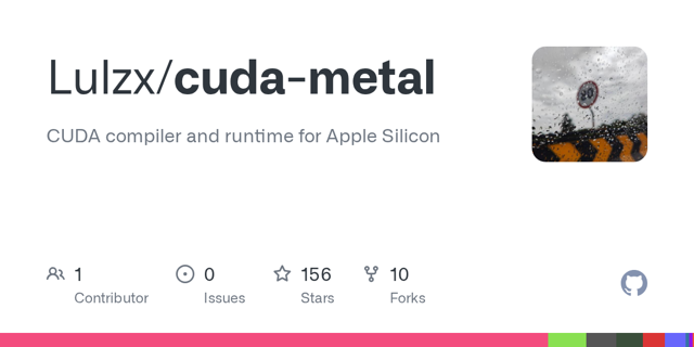
 github.com