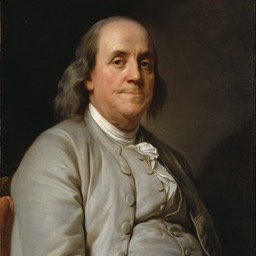
a story told on the scroll, a card per chapter, its words beside its scene
npx shadcn add @ag/scroll-storyAlready installed? Preview an update
npx shadcn add @ag/scroll-story --dry-runYour installed source stays unchanged until you update it. How updates work
Latest changes · 2026-10-15
- New:
ScrollStory, a story told on the scroll from one list of chapters (id,label,mark, its scroll asspan/play/hold, andcontent({ p, ambient, active, driven }), what it draws at its moment). The beats, each chapter's progress, the picker's seeking and the stacked carousel (a phone, reduced motion) are derived from the list.layout="deck"slides each card in from the side (card-gallery);layout="stack"crossfades the chapters in one card.StoryCardsets a chapter's words (title,body,action,aside) beside itsscene, on eitherside. A device stands taller than its card: the story keeps room round its cards (ScrollStory'soverflow, a length) and a card's scene reaches into it (StoryCard'soverflow), never cut by the deck's edge.StoryTitleis the two-tone headline, one line or two, never three: each part unbroken, sized to fit the words' column. The cards stand on the theme's floating surface,--card, the layer above the page's--background.
the demo above, verbatim
"use client"

import { Contact, Globe, Image as ImageIcon } from "lucide-react"
import { Sample } from "@/app/samples"
import type { BrowserStep } from "@/registry/base-nova/lib/browser-session"
import { BrowserSession } from "@/registry/base-nova/ui/browser"
import {
  ContactsApp,
  contactsAppScreen,
} from "@/registry/base-nova/ui/contacts-app"
import { IphoneFrame } from "@/registry/base-nova/ui/device-frame"
import { Image } from "@/registry/base-nova/ui/image"
import {
  ScrollStory,
  StoryCard,
  type StoryChapter,
  StoryTitle,
} from "@/registry/base-nova/ui/scroll-story"

// #region chapters
// What each chapter says and shows at its moment (`p`, 0..1 as the scroll goes):
// a picture, a phone standing out of its card as its contact scrolls, a visit.
const CONTACT = [
  "BEGIN:VCARD",
  "VERSION:3.0",
  "FN:Benjamin Franklin",
  "ORG:Philadelphia Post Office",
  "PHOTO;VALUE=uri:/benjamin-franklin.png",
  "TEL;TYPE=CELL:+1 215 555 0176",
  "EMAIL;TYPE=INTERNET:ben@example.com",
  "item1.URL:https://e-id.to/franklin",
  "item1.X-ABLabel:e-ID",
  "ADR;TYPE=HOME:;;;Philadelphia;;;United States",
  "NOTE:Printer\\, writer\\, inventor.",
  "END:VCARD",
].join("\r\n")
const STEPS: BrowserStep[] = [
  { kind: "type", text: "untitled.garden", delay: 400 },
  { kind: "scroll", to: 0.7, delay: 400, ms: 1600 },
]
const PAGES = {
  "ui.adriangalilea.com": <div className="min-h-full bg-white" />,
  "untitled.garden": (
    <div className="min-h-[200%] bg-white p-10 text-zinc-900">
      <h1 className="font-semibold text-4xl tracking-tight">a garden</h1>
    </div>
  ),
}
const CHAPTERS: StoryChapter[] = [
  {
    id: "picture",
    label: "a picture",
    mark: <ImageIcon />,
    content: () => (
      <StoryCard
        title={<StoryTitle lead="a picture" rest="as wide as the card" />}
        body="The scene fills whatever the words leave."
        scene={
          <Image
            src="/lightbox/field.jpg"
            alt=""
            className="size-full rounded-2xl object-cover"
          />
        }
      />
    ),
  },
  {
    id: "phone",
    label: "a phone",
    mark: <Contact />,
    span: 1.5,
    play: 0.8,
    hold: 0.9,
    content: ({ p }) => (
      <StoryCard
        title={<StoryTitle lead="a phone" rest="out of its card" />}
        body="It stands taller than the card, its contact read down as you scroll."
        overflow
        scene={
          <div className="flex h-full justify-center">
            <IphoneFrame
              className="h-full w-auto"
              style={contactsAppScreen("contact", "#8a7f6a")}
            >
              <ContactsApp
                vcard={CONTACT}
                view="contact"
                scroll={p}
                average="#8a7f6a"
              />
            </IphoneFrame>
          </div>
        }
      />
    ),
  },
  {
    id: "visit",
    label: "a visit",
    mark: <Globe />,
    content: ({ p }) => (
      <StoryCard
        side="start"
        title={<StoryTitle lead="a visit" rest="on the scroll" />}
        body="An address typed and the page read, as far as you have scrolled."
        scene={
          <div className="grid h-full place-items-center">
            <BrowserSession
              start="ui.adriangalilea.com"
              steps={STEPS}
              pages={PAGES}
              progress={p}
              alt="untitled.garden typed and scrolled"
            />
          </div>
        }
      />
    ),
  },
]
// #endregion

export default function ScrollStoryDemo() {
  return (
    <div className="space-y-16">
      <Sample
        name="deck"
        title="a deck"
        description="each chapter a card sliding in from the side as the scroll reaches it"
        with="chapters"
      >
        <ScrollStory
          label="a story"
          chapters={CHAPTERS}
          picker="labels"
          overflow="3rem"
        />
      </Sample>
      <Sample
        name="stack"
        title="a stack"
        description="one card in place, its chapters crossfading in it"
        with="chapters"
      >
        <ScrollStory
          label="a story"
          chapters={CHAPTERS}
          layout="stack"
          overflow="3rem"
        />
      </Sample>
    </div>
  )
}
the source, every file an install writes
"use client"

// A STORY TOLD ON THE SCROLL, chapter by chapter, each a card: its words and the
// thing it is about (a device playing, a picture, a list), the scroll moving
// through the chapters and through each one. One list of chapters says it all:
// how much scroll each takes, its name and mark in the picker, and what it draws
// at its moment. From it the scroll's beats (scroll-stage-timeline), each
// chapter's progress, the picker's seeking and the stacked alternative where the
// stage does not pin (a phone, reduced motion) are derived, never kept twice.
//
//   <ScrollStory label="what it does" overflow="3rem" chapters={[
//     { id: "link", label: "one link", mark: <Route />, span: 2,
//       content: ({ p }) => (
//         <StoryCard title={<StoryTitle lead="one link" rest="to route them all" />}
//           scene={<Laptop at={p} />} overflow />
//       ) },
//   ]} />
//
// Two layouts (`layout`): `deck`, the chapters a row of cards, each sliding in
// from the side as the scroll reaches it (card-gallery, driven by the timeline);
// `stack`, one card in place, its chapters crossfading in it. Stacked, the deck is
// the same cards as a carousel a finger swipes, each at rest.
//
// THE CARD (`StoryCard`) is the words beside the scene: the headline (`StoryTitle`,
// its lead bright, its rest dimmer), a line, a press, and whatever else the chapter
// says, in a column of reading width; the scene filling the rest, on either side
// (`side`), inside the card's padding. A device may stand taller than the card: the
// story keeps room round its cards (`overflow` on `ScrollStory`, a length) and a
// card's scene reaches into it (`overflow` on `StoryCard`), so it pops out of the
// card, as a phone held up does, and nothing cuts it. Below lg the words stand
// over the scene.

import * as React from "react"
import { cn } from "@/lib/utils"
import {
  CardGallery,
  type CardGalleryProps,
} from "@/registry/base-nova/ui/card-gallery"
import { PreviewPicker } from "@/registry/base-nova/ui/preview-picker"
import { ScrollStage } from "@/registry/base-nova/ui/scroll-stage"
import {
  type ScrollBeat,
  useScrollStageTimeline,
} from "@/registry/base-nova/ui/scroll-stage-timeline"

/** Where a chapter is when it is drawn. */
export interface StoryMoment {
  /** The chapter's own progress, 0 as it arrives to 1 once it has played (its
   *  `play`); 1 stacked, at rest. */
  p: number
  /** The whole story's position in chapters (2.5 is halfway through the third),
   *  running on past the last while the stage leaves: for what keeps moving
   *  after it has played (a list scrolling as the page goes). */
  ambient: number
  /** The chapter on stage. */
  active: boolean
  /** Pinned and driven by the scroll; false stacked, where every chapter rests. */
  driven: boolean
}

export interface StoryChapter {
  id: string
  /** Its name, in the picker and to assistive tech. */
  label: string
  /** Its glyph in the picker. */
  mark: React.ReactNode
  /** The scroll it takes, relative to the others (1 unless set). */
  span?: number
  /** The share of its scroll by which it has played (`p` reaches 1), and after
   *  which the next one starts coming (scroll-stage-timeline's beat). */
  play?: number
  hold?: number
  /** What it draws at its moment. */
  content: (moment: StoryMoment) => React.ReactNode
}

export interface ScrollStoryProps {
  chapters: readonly StoryChapter[]
  /** The story's name, for assistive tech and the picker. */
  label: string
  /** `deck`: cards sliding in from the side. `stack`: one card, its chapters
   *  crossfading in it. */
  layout?: "deck" | "stack"
  /** Above the cards, pinned with them. */
  heading?: React.ReactNode
  /** Where the stage pins (scroll-stage): wide screens (`desktop`), or phones too. */
  pin?: "desktop" | "all"
  /** Scroll per chapter, a CSS length (scroll-stage's `pace`); after the last. */
  pace?: string
  tail?: string
  /** What the pinned stage keeps clear of: the site's bar above, room below. */
  clear?: { top?: number | string; bottom?: number | string }
  /** The picker under the cards: marks alone, or marks with their labels. */
  picker?: "icons" | "labels"
  /** How far a scene may stand out of its card, past its top and foot, a CSS
   *  length: the room the deck keeps round its cards, which a `StoryCard`'s
   *  `overflow` reaches into. */
  overflow?: string
  /** The deck's own options (card-gallery): reaching the window's edges, room
   *  kept for a sidebar, its parts' classes. */
  deck?: Pick<
    CardGalleryProps,
    "bleed" | "insetInlineEnd" | "classNames" | "className"
  >
  className?: string
}

/** A card's surface and its height, the deck's own (card-gallery) for the stack:
 *  the two layouts draw the same card. */
const CARD = "rounded-[2rem] bg-(--card-bg)"

/** The story's defaults, as custom properties a consumer overrides by class: the
 *  card's ground the theme's own floating surface (`--card`, the layer above the
 *  page's `--background`), never a mix of its own; its height what the window
 *  leaves under a bar and above the picker. */
const STORY_VARS =
  "[--card-bg:var(--color-card)] [--card-h:clamp(28rem,calc(100svh-13rem),46rem)]"

/** The same ground handed to the deck, whose own default is nearer the cards
 *  than the story's root; a consumer's deck class still overrides it. Read as
 *  `--color-card`, never `--card`: inside the deck `--card` is the cards' width
 *  (card-gallery), and a colour read from it there came out transparent. */
const DECK_GROUND = "[--card-bg:var(--color-card)]"

/** The deck's room above and below its cards: a rem of its own, and as far as a
 *  scene stands out of its card (`--story-overflow`), so nothing standing out is
 *  cut by the deck's edge (its fade masks all outside its box). */
const DECK_ROOM = "py-[calc(1rem+var(--story-overflow,0px))]"

function beatsOf(chapters: readonly StoryChapter[]): ScrollBeat[] {
  return chapters.map((c) => ({
    span: c.span ?? 1,
    play: c.play ?? 0.6,
    hold: c.hold ?? 0.85,
  }))
}

export function ScrollStory({
  chapters,
  label,
  layout = "deck",
  heading,
  pin = "desktop",
  pace,
  tail,
  clear,
  picker = "icons",
  overflow,
  deck,
  className,
}: ScrollStoryProps) {
  if (
    chapters.length === 0 ||
    new Set(chapters.map((c) => c.id)).size !== chapters.length
  )
    throw new Error("ScrollStory: chapters must be nonempty, their ids unique")
  // The beats change only with the chapters' timing, never with what they draw:
  // keyed on it, so a parent re-rendering with new content keeps the same beats.
  const timing = chapters
    .map((c) => `${c.span ?? 1}/${c.play ?? 0.6}/${c.hold ?? 0.85}`)
    .join(",")
  // biome-ignore lint/correctness/useExhaustiveDependencies: keyed on the timing alone
  const beats = React.useMemo(() => beatsOf(chapters), [timing])
  const room = overflow
    ? ({ "--story-overflow": overflow } as React.CSSProperties)
    : undefined
  const roomy = {
    ...deck,
    className: cn(DECK_GROUND, deck?.className),
    classNames: {
      ...deck?.classNames,
      viewport: cn(overflow && DECK_ROOM, deck?.classNames?.viewport),
    },
  }
  return (
    <ScrollStage
      acts={chapters.length}
      pin={pin}
      pace={pace}
      tail={tail}
      aria-label={label}
      className={cn(STORY_VARS, className)}
      style={room}
      stacked={
        <div className={STORY_VARS} style={room}>
          {heading}
          <CardGallery
            {...roomy}
            label={label}
            picker={picker}
            items={chapters.map((c) => ({
              id: c.id,
              label: c.label,
              mark: c.mark,
              content: c.content({
                p: 1,
                ambient: 0,
                active: true,
                driven: false,
              }),
            }))}
          />
        </div>
      }
    >
      <Driven
        chapters={chapters}
        beats={beats}
        label={label}
        layout={layout}
        heading={heading}
        clear={clear}
        picker={picker}
        deck={roomy}
      />
    </ScrollStage>
  )
}

/** The pinned story: the timeline read from the scroll, each chapter drawn at its
 *  moment, in the layout chosen. */
function Driven({
  chapters,
  beats,
  label,
  layout,
  heading,
  clear,
  picker,
  deck,
}: Required<
  Pick<ScrollStoryProps, "chapters" | "label" | "layout" | "picker">
> &
  Pick<ScrollStoryProps, "heading" | "clear" | "deck"> & {
    beats: readonly ScrollBeat[]
  }) {
  const t = useScrollStageTimeline(beats, clear)
  const moment = (i: number): StoryMoment => ({
    p: t.progress[i] ?? 0,
    ambient: t.ambient,
    active: t.active === i,
    driven: true,
  })
  return (
    <div className="w-full min-w-0">
      {heading}
      {layout === "deck" ? (
        <CardGallery
          {...deck}
          label={label}
          picker={picker}
          timeline={{ offset: t.offset, seek: t.seek }}
          items={chapters.map((c, i) => ({
            id: c.id,
            label: c.label,
            mark: c.mark,
            content: c.content(moment(i)),
          }))}
        />
      ) : (
        <Stack
          chapters={chapters}
          label={label}
          picker={picker}
          offset={t.offset}
          active={t.active}
          seek={t.seek}
          moment={moment}
        />
      )}
    </div>
  )
}

/** One card in place, the chapters laid in one cell (so the card is as tall as the
 *  tallest, and never changes height between them), each faded and drifted by how
 *  far it is from being on (`offset - i`), taking no hand while it is away. */
function Stack({
  chapters,
  label,
  picker,
  offset,
  active,
  seek,
  moment,
}: {
  chapters: readonly StoryChapter[]
  label: string
  picker: "icons" | "labels"
  offset: number
  active: number
  seek: (index: number) => unknown
  moment: (i: number) => StoryMoment
}) {
  return (
    // As wide as the deck's card (card-gallery's `--card`), in the story's width.
    <div className="@container w-full">
      <section
        data-slot="scroll-story-stack"
        aria-label={label}
        className={cn("mx-auto w-[min(88cqw,72rem)] space-y-8", DECK_ROOM)}
      >
        <div className="grid">
          {chapters.map((c, i) => {
            const d = offset - i
            const away = Math.min(1, Math.abs(d))
            return (
              // biome-ignore lint/a11y/useSemanticElements: a slide groups content, not form fields
              <div
                key={c.id}
                data-slot="scroll-story-chapter"
                role="group"
                aria-roledescription="slide"
                aria-label={`${c.label}, ${i + 1} of ${chapters.length}`}
                inert={away >= 0.5}
                aria-hidden={away >= 0.5 || undefined}
                className={cn("col-start-1 row-start-1", CARD)}
                style={{
                  opacity: Math.max(0, 1 - away * 1.4),
                  transform: `translateY(${-d * 2}rem)`,
                  visibility: away >= 1 ? "hidden" : undefined,
                }}
              >
                {c.content(moment(i))}
              </div>
            )
          })}
        </div>
        <div className="flex justify-center">
          <PreviewPicker
            label={label}
            value={active}
            onChange={seek}
            iconsOnly={picker === "icons"}
            options={chapters.map((c, value) => ({
              value,
              label: c.label,
              icon: c.mark,
            }))}
          />
        </div>
      </section>
    </div>
  )
}

// ── the card ──

/** A chapter's headline in two tones: what it is, bright, and the rest, dimmer. */
/** How wide a character of the headline's face is, in ems, on average over a
 *  line of words with their spaces (measured on e-id's Space Grotesk semibold,
 *  0.44; a little over it, so a line always fits). */
const TITLE_CHAR_EM = 0.47

/** A chapter's headline in two tones: what it is, bright, and the rest, dimmer.
 *  Each part one unbroken line, so the headline is one line or two, never three
 *  (a balanced wrap broke "to route them all" across two): sized down from the
 *  heading's own size until the longer part fits the words' column, in
 *  characters per line, the unit the fit is felt in. Both share a line where
 *  there is room. */
export function StoryTitle({ lead, rest }: { lead: string; rest?: string }) {
  const chars = Math.max(lead.length, rest?.length ?? 0)
  return (
    <span
      data-slot="story-title"
      className="flex flex-wrap gap-x-[0.28em] text-[min(1em,calc(100cqi/var(--story-title-chars)))]"
      style={
        {
          "--story-title-chars": `${chars * TITLE_CHAR_EM}`,
        } as React.CSSProperties
      }
    >
      <span className="whitespace-nowrap text-foreground">{lead}</span>
      {rest && (
        <span className="whitespace-nowrap text-foreground/45">{rest}</span>
      )}
    </span>
  )
}

export interface StoryCardProps {
  /** The headline (`StoryTitle` for the two tones). */
  title: React.ReactNode
  /** A line under it. */
  body?: React.ReactNode
  /** The press the chapter is about (a button, a code block). */
  action?: React.ReactNode
  /** Anything else beside the scene (where a visit is, a list). */
  aside?: React.ReactNode
  /** What the chapter shows: a device, a picture, a list. */
  scene: React.ReactNode
  /** Which side of the card the scene stands on, on a wide screen. */
  side?: "start" | "end"
  /** The scene stands out of the card, past its top and foot, by the story's
   *  room (`ScrollStory`'s `overflow`): a device taller than the card. */
  overflow?: boolean
  className?: string
}

/** A chapter's card: its words in a column of reading width, its scene filling
 *  the rest on its side, inside the card's padding (a device's foot never meets
 *  the card's rounded corner), as tall as the story's cards
 *  (`--card-h`). */
export function StoryCard({
  title,
  body,
  action,
  aside,
  scene,
  side = "end",
  overflow = false,
  className,
}: StoryCardProps) {
  return (
    <div
      data-slot="story-card"
      className={cn(
        "grid h-(--card-h) grid-rows-[auto_minmax(0,1fr)] gap-6 p-6 lg:grid-rows-[minmax(0,1fr)] lg:gap-10 lg:p-10",
        side === "end"
          ? "lg:grid-cols-[clamp(15rem,26%,20rem)_minmax(0,1fr)]"
          : "lg:grid-cols-[minmax(0,1fr)_clamp(15rem,26%,20rem)]",
        className,
      )}
    >
      {/* The words: the headline, then what follows it, a step apart (the 8 px
          doubling rhythm: 32 after the headline, 24 between what follows). Its
          own container, the width the headline fits itself to. */}
      <div
        data-slot="story-card-words"
        className={cn(
          "@container flex min-w-0 flex-col gap-6",
          side === "start" && "lg:col-start-2 lg:row-start-1",
        )}
      >
        <h3 className="mb-2 font-semibold text-3xl leading-[1.05] tracking-tight lg:text-5xl">
          {title}
        </h3>
        {body && (
          <p className="text-pretty text-base text-foreground/60 leading-relaxed lg:text-lg">
            {body}
          </p>
        )}
        {action}
        {aside}
      </div>
      <div
        data-slot="story-card-scene"
        className={cn(
          "relative min-h-0 min-w-0",
          side === "start" && "lg:col-start-1 lg:row-start-1",
          // Past the card's padding and out of it: the card has no clip, so the
          // scene stands over its edge.
          overflow && "lg:-my-[calc(2.5rem+var(--story-overflow,0px))]",
        )}
      >
        {scene}
      </div>
    </div>
  )
}