the controls for a video or any clock: a bar cut in chapters, transport, speed
npx shadcn add @ag/playerAlready installed? Preview an update
npx shadcn add @ag/player --dry-runYour installed source stays unchanged until you update it. How updates work
Latest changes · 2026-10-12
- Changed: the playlist card opened from the bar (
PlayerPlaylistButton) stays whole; its rows scroll inside it and fade their cut edges. - New:
PLAYER_BUTTON,PLAYER_DISCandPLAYER_DISC_SIZE, the player's plain faces (a quiet bar button, a dark disc over the picture at the transport's sizes), for a control of your own that must read as the player's.
also called video player, media player, audio player
uses clip, timebase, playback, button, material, popover, tooltip, menu, kbd, key-router, image, media-line, scrims, scroll-area
used by film-mosaic
the demo above, verbatim
"use client"

import { Sample } from "@/app/samples"
import artJson from "@/public/macos/awake/art.json"
import heroJson from "@/public/macos/awake/hero.json"
import {
  type Art,
  sceneClock,
  type Timeline,
} from "@/registry/base-nova/lib/macos-session"
import { ClaudeCode } from "@/registry/base-nova/ui/claude-code"
import { Codex } from "@/registry/base-nova/ui/codex"
import { Macos } from "@/registry/base-nova/ui/macos"
import {
  Player,
  PlayerBar,
  PlayerCaptions,
  PlayerChrome,
  PlayerFoot,
  PlayerFullscreen,
  PlayerSound,
  PlayerSpeed,
  PlayerTransport,
} from "@/registry/base-nova/ui/player"
import {
  VideoPicture,
  VideoPlayback,
} from "@/registry/base-nova/ui/video-playback"

// #region macos
const HERO = heroJson as Timeline
const CLOCK = sceneClock(HERO)
const AGENTS = { claude: ClaudeCode, codex: Codex }
// #endregion

// #region faces
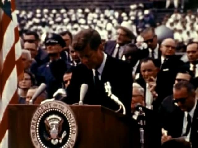
const MOON = {
  src: "/kennedy/moon.mp4",
  poster: "/kennedy/moon.jpg",
  width: 640,
  height: 480,
  label: "We choose to go to the Moon",
  captions: [
    {
      src: "/kennedy/moon.en.vtt",
      lang: "en",
      label: "English",
      default: true,
    },
    { src: "/kennedy/moon.es.vtt", lang: "es", label: "español" },
  ],
}
// #endregion

export default function PlayerDemo() {
  return (
    <div className="space-y-12">
      <Sample
        name="video"
        glance="large"
        title="a video, its bar"
        description="the plain chrome over one video: a transport in the middle, the bar at the foot"
        with="faces"
      >
        <div className="w-full max-w-md">
          <VideoPlayback {...MOON}>
            <VideoPicture>
              <PlayerChrome>
                <PlayerTransport />
                <PlayerFoot>
                  <PlayerBar label={MOON.label} playButton={false}>
                    <PlayerCaptions />
                    <PlayerSound />
                    <PlayerFullscreen />
                  </PlayerBar>
                </PlayerFoot>
              </PlayerChrome>
            </VideoPicture>
          </VideoPlayback>
        </div>
      </Sample>
      <Sample
        name="macos"
        title="a macos stage"
        description="its captions are the chapters"
        with="macos"
      >
        <Player clip={CLOCK.clip} label="awake's hero scene" chapters="hover">
          <Macos
            timeline={HERO}
            art={artJson as Art}
            agents={AGENTS}
            accent="#e7a13c"
            device="macbook"
            alt="awake: Claude Code at work, ⌃⌥⌘A keeps the Mac awake, the lid closes, the work gets done"
          />
        </Player>
      </Sample>
      <Sample
        name="faces"
        title="plain and glass"
        description="the chrome's material is every part's inside it, their menus and tooltips too; the picture makes them dark"
        with="faces"
      >
        <div className="grid gap-6 sm:grid-cols-2">
          {(["plain", "glass"] as const).map((material) => (
            <VideoPlayback key={material} {...MOON}>
              <VideoPicture>
                <PlayerChrome material={material}>
                  <PlayerTransport />
                  <PlayerFoot>
                    <PlayerBar
                      label={MOON.label}
                      chapters="hover"
                      playButton={false}
                    >
                      <PlayerCaptions />
                      <PlayerSpeed />
                      <PlayerSound />
                      <PlayerFullscreen />
                    </PlayerBar>
                  </PlayerFoot>
                </PlayerChrome>
              </VideoPicture>
            </VideoPlayback>
          ))}
        </div>
      </Sample>
    </div>
  )
}
the source, every file an install writes
"use client"
// The controls for a timebase (lib/timebase), whoever owns it: a clip's own clock
// (ui/playback) or a video's decoder (ui/video). `PlayerBar` is the timeline: thick,
// cut into the chapters, the played part in the accent; hovering it shows that exact
// moment (the timebase holds while it previews, the chapter and the time above the
// pointer) and leaving returns to where it was; a click or a drag commits and plays
// from there; under the keyboard it is a slider. Its `face` swaps the drawing and
// keeps the control (ui/sound-timeline draws the sound itself along the track).
// `Player` is the preset for drawn
// content: `<Player clip={clip}><Terminal session={s} /></Player>` is a Playback with
// the bar under the content, a click on the content plays and pauses, a horizontal
// swipe scrubs. Keys on the bar: space plays and pauses, ← and → move between
// chapters, Home and End go to the ends. Reduced motion starts paused on the last
// frame.
import { Slider } from "@base-ui/react/slider"
import * as React from "react"
import { cn } from "@/lib/utils"
import {
type Clip,
type Division,
divisionSpans,
type Level,
outlineOf,
} from "@/registry/base-nova/lib/clip"
import {
type PinchRung,
pinchRung,
rungTaken,
visibleRect,
} from "@/registry/base-nova/lib/picture-zoom"
import {
createSwipe,
type PlayerAction,
resolveKey,
type SwipeEffect,
} from "@/registry/base-nova/lib/player-input"
import {
clockTime,
type TimeForm,
timeLabel,
widest,
} from "@/registry/base-nova/lib/timebase"
import { Button } from "@/registry/base-nova/ui/button"
import { Image } from "@/registry/base-nova/ui/image"
import { Kbd, KeysText } from "@/registry/base-nova/ui/kbd"
import { useKeys } from "@/registry/base-nova/ui/key-router"
import {
type Material,
MaterialProvider,
type Scheme,
useMaterial,
useScheme,
useSurfaceScheme,
} from "@/registry/base-nova/ui/material"
import {
Glass,
GlassEdge,
glassVariants,
schemeOf,
} from "@/registry/base-nova/ui/material-glass"
import {
type MediaCaptions,
useCaptions,
} from "@/registry/base-nova/ui/media-captions"
import { lineShare, MediaLine } from "@/registry/base-nova/ui/media-line"
import {
DropdownMenu,
DropdownMenuContent,
DropdownMenuRadioGroup,
DropdownMenuRadioItem,
DropdownMenuTrigger,
} from "@/registry/base-nova/ui/menu"
import { pinchInput } from "@/registry/base-nova/ui/pinch-input"
import {
OutlineProvider,
onScreenChange,
PLAYER_FLASH,
type PlaybackOptions,
type Playlist,
type PlaylistEntry,
screenHolder,
TimebaseProvider,
toggleFullscreen,
useHoverIntent,
useOutline,
usePictureZoom,
usePictureZoomState,
usePlayback,
usePlaylist,
useTimebase,
useTimebaseState,
} from "@/registry/base-nova/ui/playback"
import {
Popover,
PopoverContent,
PopoverTrigger,
} from "@/registry/base-nova/ui/popover"
import { ScrollArea } from "@/registry/base-nova/ui/scroll-area"
import { Tip } from "@/registry/base-nova/ui/tooltip"
/** What a click on the elapsed side will show next. */
const FORM_NEXT: Record<TimeForm, string> = {
clock: "show the clock",
frame: "show the frame",
timecode: "show the timecode",
}
/** A mouse press on a player's controls leaves focus where it was, as players do: a
* clicked control holding focus made the page-wide keys answer to it instead (← → on
* a clicked bar moved chapters, not frames), and the next key press showed the focus
* ring on it, since a key with focus somewhere is the browser's cue that a keyboard
* is in use. The keyboard still reaches every control with Tab, ringed as it should
* be. Put on the controls' containers (PlayerBar, PlayerChrome), it covers every
* control inside, the ones added later too; a portaled popup (the speed menu) is not
* inside in the DOM, so it keeps managing its own focus. */
export function keepFocus(e: React.MouseEvent) {
if (e.button === 0 && e.currentTarget.contains(e.target as Node))
e.preventDefault()
}
/** The gap between two chapters on the bar, px. */
const GAP = 3
/** How close the pointer must come to a snap point to be pulled onto it, px. */
const SNAP_PX = 10
/** A point on the bar the hand is pulled onto, named in the tip when it lands there
* ("moment starts"). Chapter starts are always ones; a face adds its own. */
export interface PlayerSnap {
/** ms on the timebase. */
at: number
label: string
}
/** A division's title as its kind reads: a command in mono, as typed; words with
* their shortcuts drawn as keys. */
function ChapterTitle({ chapter }: { chapter: Division | undefined }) {
if (!chapter?.title) return null
return chapter.code ? (
<code className="font-mono">{chapter.title}</code>
) : (
<KeysText>{chapter.title}</KeysText>
)
}
export interface PlayerBarProps extends PlayerPartProps {
/** Accessible name of the timeline. */
label: string
/** The played part of the bar. By default a quiet foreground: the bar is a
* control, and a page's accent belongs to what it wants seen first. */
accent?: string
/** Where the chapter is named. `"line"`: the chapter on screen, on a line under
* the bar. `"hover"`: only under the pointer, for content that captions itself
* (a scene's captions) or a page that wants nothing but the picture. */
chapters?: "line" | "hover"
/** Things on the row beside the bar, after the time (a sound or speed control). */
children?: React.ReactNode
/** The play button at the bar's start. Off where a PlayerTransport already has one,
* so a picture never shows two. Default true. */
playButton?: boolean
/** How the elapsed time first reads: `clock` (`0:02`, default), `frame` (`54 ·
* 0:02`) or `timecode` (`00:00:02:04`); a click moves through them. The last two
* only where the timebase knows its frames. */
time?: TimeForm
/** What the timeline draws instead of its chapter bar: a SoundTimeline, or any
* drawing that reads the timebase itself (`useTimebaseState`) and fills the width.
* The track keeps everything else: it is still the slider, with the same keys, the
* hover preview, the snap to chapter starts and the time above the pointer. Its
* height is the face's own. */
face?: React.ReactNode
/** More points the hand is pulled onto while it scrubs, beside the chapter starts:
* what the face marks (an AnswerCurve's claims, `claimSnaps`). Letting go on one
* plays from exactly there. */
snaps?: readonly PlayerSnap[]
}
/** The play button, the timeline and the time, over the timebase around it. The bar
* itself is drawn in the scheme's ink in either material (a glass foot is what makes
* it glass); its tooltips and the time over the pointer wear the material. */
export function PlayerBar({
label,
accent,
chapters = "line",
children,
playButton = true,
time = "clock",
face,
snaps,
material,
scheme,
className,
}: PlayerBarProps) {
const m = useMaterial(material)
// Over a picture it is read by the band of the frame under it.
const [s, here] = useSurfaceScheme<HTMLDivElement>(scheme)
const timebase = useTimebase()
const { controls } = timebase
const at = useTimebaseState((s) => s.at)
const preview = useTimebaseState((s) => s.preview)
const duration = useTimebaseState((s) => s.duration)
const playing = useTimebaseState((s) => s.playing)
// The bar divides by the outline's first level (chapters). Finer levels show when
// the view zooms into a division (TimeAxis, to come). Until the medium's length is
// known (a video before its metadata, a prerendered page) there is nothing to
// divide: no chapters, the bar one empty track.
const level = useOutline()[0] as Level
const spans = React.useMemo(
() => (duration > 0 ? divisionSpans(level, duration) : []),
[duration, level],
)
const points = React.useMemo<PlayerSnap[]>(
() => [
...spans
.filter((c) => c.start > 0)
.map((c) => ({ at: c.start, label: "chapter start" })),
...(snaps ?? []),
],
[spans, snaps],
)
// The snap point the hand is on, if any.
const [snapped, setSnapped] = React.useState<PlayerSnap | null>(null)
// The right-hand clock shows the length, or what is left of it.
const [remaining, setRemaining] = React.useState(false)
// How finely the elapsed side reads; frames only where the timebase knows them.
const fps = useTimebaseState((s) => s.fps)
const forms: TimeForm[] = fps ? ["clock", "frame", "timecode"] : ["clock"]
const [chosen, setForm] = React.useState<TimeForm>(time)
const form = forms.includes(chosen) ? chosen : "clock"
const nextForm = forms[(forms.indexOf(form) + 1) % forms.length] as TimeForm
const keysOn = useKeysListening()
const track = React.useRef<HTMLDivElement>(null)
const dragging = React.useRef(false)
// Where a pointer points on the bar, pulled to the nearest snap point when it is
// close enough that the hand meant it (measured on the bar, in px).
const pointAt = (
clientX: number,
): { ms: number; snapped: PlayerSnap | null } => {
const r = track.current?.getBoundingClientRect()
if (!r || !duration) return { ms: 0, snapped: null }
const ms = Math.min(
duration,
Math.max(0, ((clientX - r.left) / r.width) * duration),
)
const reach = (SNAP_PX / r.width) * duration
const near = points
.filter((p) => Math.abs(p.at - ms) <= reach)
.sort((a, b) => Math.abs(a.at - ms) - Math.abs(b.at - ms))[0]
return near === undefined
? { ms, snapped: null }
: { ms: near.at, snapped: near }
}
const show = (clientX: number) => {
const p = pointAt(clientX)
setSnapped(p.snapped)
controls.preview(p.ms)
}
// Hovering previews only with intent (playback's useHoverIntent): a pointer passing
// over on its way somewhere, or the page scrolling the bar under a still pointer,
// never scrubs.
const intent = useHoverIntent((p) => show(p.clientX), controls.endPreview)
const chapterAt = (ms: number) =>
spans.findLast((c) => ms >= c.start) ?? spans[0]
const ended = duration > 0 && at >= duration
const onKey = (e: React.KeyboardEvent) => {
const here = spans.findLastIndex((c) => at >= c.start)
const map: Record<string, () => void> = {
" ": controls.toggle,
k: controls.toggle,
ArrowRight: () => controls.seek(spans[here + 1]?.start ?? duration),
// Back to this chapter's start, or the one before when already there.
ArrowLeft: () =>
controls.seek(
at - (spans[here]?.start ?? 0) > 1500
? (spans[here]?.start ?? 0)
: (spans[here - 1]?.start ?? 0),
),
Home: () => controls.seek(0),
End: () => controls.seek(duration),
}
const act = map[e.key]
if (!act) return
e.preventDefault()
act()
}
const shown = preview ?? at
const hovered = preview === null ? null : chapterAt(preview)
const bar = (
// biome-ignore lint/a11y/noStaticElementInteractions: only keeps a mouse press from taking focus; the controls inside are the interactive ones
<div
ref={here}
data-slot="player-bar"
data-material={m}
onMouseDown={keepFocus}
className={cn("@container/player-bar", schemeOf(s), className)}
style={
{
"--player-accent":
accent ?? "color-mix(in oklab, var(--foreground) 55%, transparent)",
} as React.CSSProperties
}
>
<div className="flex select-none flex-wrap items-center gap-x-3 gap-y-1 @max-[30rem]/player-bar:gap-x-2">
{/* Pulled out by the space its circle leaves around the icon,
(2rem - 0.875rem) / 2, so the icon's ink, not its hit area, starts
on the stage's edge, where the caption below starts too. */}
{playButton && (
<Tip
content={ended ? "replay" : playing ? "pause" : "play"}
keys={keysOn ? "space" : undefined}
>
<button
type="button"
data-slot="player-play"
onClick={controls.toggle}
aria-label={ended ? "replay" : playing ? "pause" : "play"}
className="-ml-[calc((2rem-0.875rem)/2)] grid size-8 shrink-0 place-items-center rounded-full text-foreground/70 transition-colors hover:bg-foreground/8 hover:text-foreground [&_svg]:size-3.5"
>
{ended ? (
<PlayerIcon.replay />
) : playing ? (
<PlayerIcon.pause />
) : (
<PlayerIcon.play />
)}
</button>
</Tip>
)}
{/* Elapsed on the bar's left, the length on its right: each end of the bar
says what it stands for. A click on the elapsed side changes how finely
it reads (the clock; the frame beside it; the editors' timecode), each in
the width of its own widest, so the bar holds still while it counts. */}
<Tip content={FORM_NEXT[nextForm]}>
<button
type="button"
data-slot="player-elapsed"
aria-label={FORM_NEXT[nextForm]}
disabled={forms.length < 2}
onClick={() => setForm(nextForm)}
className="shrink-0 cursor-pointer rounded-sm font-mono text-[11px] text-muted-foreground transition-colors enabled:hover:text-foreground disabled:cursor-default @max-[30rem]/player-bar:order-1"
>
<PlayerReadout
value={timeLabel(shown, form, fps)}
widest={widest(timeLabel(duration, form, fps))}
/>
</button>
</Tip>
<div
ref={track}
data-slot="player-track"
role="slider"
tabIndex={0}
aria-label={label}
aria-valuemin={0}
aria-valuemax={Math.round(duration)}
aria-valuenow={Math.round(at)}
aria-valuetext={`${clockTime(at)} of ${clockTime(duration)}${
chapterAt(at)?.title ? `, ${chapterAt(at)?.title}` : ""
}`}
onKeyDown={onKey}
// No ring around the bar: under the keyboard the bar itself answers,
// lifted as under the pointer, the chapter you are in lit, so focus
// reads as the control waking rather than a box drawn round it.
className={cn(
"group relative min-w-0 flex-1 cursor-pointer touch-none outline-none",
// A narrow player (a vertical video) gives the bar a row of its own
// above the buttons, instead of squeezing it between them and letting
// the last button run off the edge.
"@max-[30rem]/player-bar:order-first @max-[30rem]/player-bar:basis-full",
face ? "min-h-7" : "h-7",
)}
onPointerMove={intent.move}
onPointerLeave={() => {
if (dragging.current) return
setSnapped(null)
intent.leave()
}}
// A press is intent whatever came before it.
onPointerDown={(e) => {
dragging.current = true
e.currentTarget.setPointerCapture(e.pointerId)
intent.engage(e)
}}
// Letting go is an intent to watch there: it plays from where it is let go.
onPointerUp={(e) => {
dragging.current = false
setSnapped(null)
controls.seek(pointAt(e.clientX).ms, { play: true })
}}
>
{face}
{!face && spans.length === 0 && (
<div className="absolute inset-x-0 top-1/2 h-1.5 -translate-y-1/2 rounded-full bg-foreground/12" />
)}
{!face &&
spans.map((c) => {
const from = c.start / duration
const width = (c.end - c.start) / duration
const lit = hovered === c
const here = preview === null && chapterAt(at) === c
// Each chapter is the registry's media line (its played part in
// the bar's accent), on the bar's own track, lighter where the hand
// or the keys are; the instant under the pointer marked over it.
return (
<MediaLine
key={c.start}
duration={c.end - c.start}
at={at - c.start}
className={cn(
"absolute top-1/2 h-1.5 -translate-y-1/2 rounded-full text-(--player-accent) transition-[height,background-color] duration-150 group-hover:h-2.5 group-focus-visible:h-2.5",
lit ? "bg-foreground/25" : "bg-foreground/12",
here && "group-focus-visible:bg-foreground/25",
)}
style={{
left: `${from * 100}%`,
width: `calc(${width * 100}% - ${spans.length > 1 ? GAP : 0}px)`,
}}
>
{preview !== null && (
<div
className="absolute inset-y-0 left-0 w-(--player-preview) bg-foreground/15"
style={
{
"--player-preview": lineShare(
preview - c.start,
c.end - c.start,
),
} as React.CSSProperties
}
/>
)}
</MediaLine>
)
})}
{/* Pulled onto a snap point: a marker stands on it. */}
{preview !== null && snapped && (
<div
className="pointer-events-none absolute top-1/2 h-4 w-[3px] -translate-x-1/2 -translate-y-1/2 rounded-full bg-foreground"
style={{ left: `${(preview / duration) * 100}%` }}
/>
)}
{preview !== null && (
<div
data-material={m}
// The glass first: it carries `relative` for its rim, and placed after
// `absolute` it won, so the chip fell into the bar's flow as a strip as
// wide as the bar, over the controls above it.
className={cn(
m === "glass"
? cn(
glassVariants({ shape: "surface" }),
"[--glass-radius:--theme(--radius-lg)]",
)
: "rounded-md bg-popover text-popover-foreground shadow-md",
"pointer-events-none absolute bottom-full mb-1.5 flex -translate-x-1/2 flex-col items-center gap-0.5 whitespace-nowrap px-2 py-1 text-xs",
)}
style={{
left: `clamp(4rem, ${(preview / duration) * 100}%, calc(100% - 4rem))`,
}}
>
{/* Glass has no popover colours: its quieter words are its own ink,
fainter. */}
{hovered?.title && (
<span
className={
snapped
? "font-medium"
: m === "glass"
? "opacity-70"
: "text-popover-foreground/70"
}
>
<ChapterTitle chapter={hovered} />
</span>
)}
<span
className={cn(
"font-mono text-[10px] tabular-nums",
m === "glass" ? "opacity-60" : "text-muted-foreground",
)}
>
{snapped
? `${snapped.label} · ${clockTime(preview)}`
: clockTime(preview)}
</span>
</div>
)}
</div>
{/* The length, or on a click what is left of it: both in the same reserved
width, so the switch never moves the bar. What is left rounds up, so
elapsed and left always add up to the length. */}
<Tip content={remaining ? "show the length" : "show the time left"}>
<button
type="button"
data-slot="player-duration"
aria-label={remaining ? "show the length" : "show the time left"}
onClick={() => setRemaining((r) => !r)}
className="shrink-0 cursor-pointer rounded-sm font-mono text-[11px] text-muted-foreground transition-colors hover:text-foreground @max-[30rem]/player-bar:order-3"
>
<PlayerReadout
value={
remaining
? `-${clockTime(Math.ceil(Math.max(0, duration - shown) / 1000) * 1000)}`
: clockTime(duration)
}
widest={`-${widest(clockTime(duration))}`}
/>
</button>
</Tip>
{/* A narrow bar (its own row above): the elapsed time in the left corner,
the length in the right, the controls centred between them. */}
{children && (
<div
data-slot="player-controls"
className="flex shrink-0 items-center gap-1.5 @max-[30rem]/player-bar:order-2 @max-[30rem]/player-bar:mx-auto"
>
{children}
</div>
)}
</div>
{/* The chapter on screen, on its own line under the bar, aligned with it: its
width changes with every chapter, and beside the bar it resized the bar
under the pointer. The line is reserved, so no chapter moves the page. */}
{chapters === "line" && (
<p
data-slot="player-chapter"
aria-hidden="true"
className="mt-1 truncate pl-[calc(2.75rem-(2rem-0.875rem)/2)] text-muted-foreground text-xs leading-5"
>
<ChapterTitle chapter={chapterAt(shown)} />
​
</p>
)}
</div>
)
// What sits in the bar (a speed, a sound) wears its material and scheme too.
return (
<MaterialProvider material={m} scheme={s}>
{bar}
</MaterialProvider>
)
}
export interface PlayerProps extends PlaybackOptions {
/** The content: components on the clip contract read the moment from the player. */
children: React.ReactNode
/** What it plays: its length and its chapters. */
clip: Clip
/** Accessible name of the player. */
label: string
accent?: string
chapters?: "line" | "hover"
className?: string
}
/** Drawn content with its bar: a Playback, the content, and PlayerBar under it. */
export function Player({
children,
clip,
label,
accent,
chapters = "line",
className,
...options
}: PlayerProps) {
const { root, timebase } = usePlayback(clip, options)
const outline = React.useMemo(() => outlineOf(clip), [clip])
// A horizontal swipe scrubs; a vertical one stays the page's.
React.useEffect(() => {
const el = root.current
if (!el) return
const wheel = (e: WheelEvent) => {
if (Math.abs(e.deltaX) <= Math.abs(e.deltaY)) return
e.preventDefault()
const width = el.getBoundingClientRect().width || 1
timebase.controls.jump((e.deltaX / width) * timebase.get().duration)
}
el.addEventListener("wheel", wheel, { passive: false })
return () => el.removeEventListener("wheel", wheel)
}, [root, timebase])
return (
<div ref={root} data-slot="player" className={className}>
<TimebaseProvider timebase={timebase}>
<OutlineProvider outline={outline}>
{/* A click anywhere on the content plays and pauses, as on a video; a control
inside the content (a reaction pill) keeps its own click. The bar's button
is the keyboard's way. */}
{/* biome-ignore lint/a11y/noStaticElementInteractions: the bar's button is the accessible control */}
{/* biome-ignore lint/a11y/useKeyWithClickEvents: space and k toggle on the bar */}
<div
data-slot="player-content"
onClick={(e) => {
if (
(e.target as Element).closest(
"button, a, input, select, textarea, [role=button], [role=slider]",
)
)
return
timebase.controls.toggle()
}}
>
{children}
</div>
{/* --player-gap: the stage-to-controls gap, for a page that spaces its
parts by its own step (default 1rem). */}
<PlayerBar
label={label}
accent={accent}
chapters={chapters}
className="mt-(--player-gap,1rem)"
/>
</OutlineProvider>
</TimebaseProvider>
</div>
)
}
// ── the rest of a player: each a part over the timebase around it, shown only when
// the timebase can do what it controls ─────────────────────────────────────────────
const READOUT = "font-mono text-[11px] text-muted-foreground tabular-nums"
const BUTTON =
"inline-flex h-7 shrink-0 cursor-pointer items-center justify-center rounded-md px-1.5 text-foreground/70 transition-colors hover:bg-foreground/8 hover:text-foreground"
/** A number that changes, at a width that never does: the value drawn over an
* invisible copy of the widest it can ever be (`widest`), right-aligned, in tabular
* figures. Every counting readout in a player goes through here, so a clock ticking
* from 9 to 10 or a frame number from 99 to 100 can never move the row it sits in. */
export function PlayerReadout({
value,
widest: wide,
align = "end",
className,
}: {
value: string
/** The widest value this readout will show, in its own shape (lib/timebase
* `widest`). */
widest: string
/** Where the value sits in its reserved width: `end` for a number that counts (its
* last digit never moves), `center` for a label inside a button (a speed). */
align?: "end" | "center"
className?: string
}) {
return (
<span className={cn("inline-grid tabular-nums", className)}>
<span aria-hidden className="invisible col-start-1 row-start-1">
{wide.length >= value.length ? wide : widest(value)}
</span>
<span
className={cn(
"col-start-1 row-start-1",
align === "end" ? "text-right" : "text-center",
)}
>
{value}
</span>
</span>
)
}
// ── the curated controls. Each is logic once (a hook over the timebase) and two faces,
// as every base control is: `material` (plain or glass) and `scheme` (the colour scheme
// it stands in), each its own prop or the nearest MaterialProvider's. The picture (a
// VideoPicture) stands what it holds in the dark scheme, and PlayerChrome
// gives what it holds its material, so `<PlayerChrome material="glass">` puts every part
// inside in dark glass. The glass faces are the base controls in glass (Button,
// DropdownMenu, Popover, Tip), drawing the same icons. ────────────────────────────────
/** A part's own `material` and `scheme`, else the provider's. */
export interface PlayerPartProps {
material?: Material
scheme?: Scheme
className?: string
}
/** The player's icons, drawn once for every face, plain and glass. 16-unit boxes, the
* ink `currentColor`, sized by the button that holds them. */
export const PlayerIcon = {
playlist: () => (
<svg viewBox="0 0 16 16" aria-hidden="true">
<path
d="M2.5 4h7M2.5 8h7M2.5 12h4.5"
fill="none"
stroke="currentColor"
strokeWidth="1.6"
strokeLinecap="round"
/>
<path d="M11 9.5v5l3.8-2.5z" fill="currentColor" />
</svg>
),
play: () => (
<svg viewBox="0 0 16 16" aria-hidden="true">
<path d="M4.5 2.8 13 8l-8.5 5.2z" fill="currentColor" />
</svg>
),
pause: () => (
<svg viewBox="0 0 16 16" aria-hidden="true">
<path d="M4 3h2.6v10H4zM9.4 3H12v10H9.4z" fill="currentColor" />
</svg>
),
replay: () => (
<svg viewBox="0 0 16 16" aria-hidden="true">
<path
d="M3.5 8a4.5 4.5 0 1 0 1.4-3.3M3.5 2.5v2.6h2.6"
fill="none"
stroke="currentColor"
strokeWidth="1.6"
strokeLinecap="round"
strokeLinejoin="round"
/>
</svg>
),
previous: () => (
<svg viewBox="0 0 16 16" aria-hidden="true">
<path d="M3.5 3h1.8v10H3.5zM13 3v10L6 8z" fill="currentColor" />
</svg>
),
next: () => (
<svg viewBox="0 0 16 16" aria-hidden="true">
<path d="M10.7 3h1.8v10h-1.8zM3 3v10l7-5z" fill="currentColor" />
</svg>
),
/** A circular arrow round the seconds it jumps: back (counter-clockwise) or forward. */
jump: ({ seconds, back }: { seconds: number; back: boolean }) => (
<svg viewBox="0 0 16 16" aria-hidden="true">
<g transform={back ? undefined : "translate(16 0) scale(-1 1)"}>
<path
d="M5.2 3.1A6 6 0 1 1 2.3 8"
fill="none"
stroke="currentColor"
strokeWidth="1.3"
strokeLinecap="round"
/>
<path
d="M5.9 0.9 5.2 3.1l2.3.6"
fill="none"
stroke="currentColor"
strokeWidth="1.3"
strokeLinecap="round"
strokeLinejoin="round"
/>
</g>
<text
x="8"
y="10.6"
textAnchor="middle"
fontSize="6.4"
fontWeight="600"
fill="currentColor"
fontFamily="ui-sans-serif, system-ui"
>
{seconds}
</text>
</svg>
),
/** The speaker, its waves the loudness: none (muted or 0), one, two. */
sound: ({ level }: { level: 0 | 1 | 2 }) => (
<svg viewBox="0 0 16 16" aria-hidden="true">
<path d="M2.5 6h2.5L8.5 3v10L5 10H2.5z" fill="currentColor" />
{level === 0 ? (
<path
d="M11 6l3.5 4M14.5 6L11 10"
stroke="currentColor"
strokeWidth="1.4"
strokeLinecap="round"
/>
) : (
<path
d={
level === 1
? "M11 5.5a3.5 3.5 0 0 1 0 5"
: "M11 5.5a3.5 3.5 0 0 1 0 5M12.6 3.8a6 6 0 0 1 0 8.4"
}
fill="none"
stroke="currentColor"
strokeWidth="1.4"
strokeLinecap="round"
/>
)}
</svg>
),
/** Four corners: pointing out to go fullscreen, in to leave it. */
fullscreen: ({ on }: { on: boolean }) => (
<svg viewBox="0 0 16 16" aria-hidden="true">
<path
d={
on
? "M6 2.5V6H2.5M10 2.5V6h3.5M6 13.5V10H2.5M10 13.5V10h3.5"
: "M2.5 6V2.5H6M13.5 6V2.5H10M2.5 10v3.5H6M13.5 10v3.5H10"
}
fill="none"
stroke="currentColor"
strokeWidth="1.6"
strokeLinecap="round"
strokeLinejoin="round"
/>
</svg>
),
/** A screen with two lines of words in it, filled while captions show (the words
* cut out of it, so it reads on any ground). */
captions: function Captions({ on }: { on: boolean }) {
const cut = `${React.useId()}-cut`
return (
<svg viewBox="0 0 16 16" aria-hidden="true">
{on ? (
<>
<mask id={cut}>
<rect width="16" height="16" fill="white" />
<path
d="M4.3 7.2h4.4M10.2 7.2h1.5M4.3 9.8h2M7.8 9.8h3.9"
stroke="black"
strokeWidth="1.4"
strokeLinecap="round"
/>
</mask>
<rect
x="1.5"
y="3"
width="13"
height="10"
rx="2.2"
fill="currentColor"
mask={`url(#${cut})`}
/>
</>
) : (
<>
<rect
x="2.2"
y="3.7"
width="11.6"
height="8.6"
rx="1.8"
fill="none"
stroke="currentColor"
strokeWidth="1.4"
/>
<path
d="M4.6 7.2h4.1M10.1 7.2h1.3M4.6 9.6h1.8M7.8 9.6h3.6"
stroke="currentColor"
strokeWidth="1.3"
strokeLinecap="round"
/>
</>
)}
</svg>
)
},
check: () => (
<svg viewBox="0 0 16 16" aria-hidden="true">
<path
d="M3.5 8.5 6.5 11.5 12.5 4.5"
fill="none"
stroke="currentColor"
strokeWidth="1.6"
strokeLinecap="round"
strokeLinejoin="round"
/>
</svg>
),
}
/** How far into an item or a division "previous" goes back to its start rather than to
* the one before, ms: a person a few seconds in means "again", at the start "before". */
const RESTART_MS = 1500
/** Play, pause, the jumps and the neighbours, as the transport faces use them. The
* neighbours are the playlist's items when there is a playlist (`unit` "item"), else
* the outline's divisions (`unit` "chapter"); `previous`/`next` are null where there
* is none to go to. */
export function useTransport() {
const { controls } = useTimebase()
const playing = useTimebaseState((s) => s.playing)
const at = useTimebaseState((s) => s.at)
const duration = useTimebaseState((s) => s.duration)
const level = useOutline()[0] as Level
const playlist = usePlaylist()
return {
playing,
ended: duration > 0 && at >= duration,
toggle: controls.toggle,
jump: controls.jump,
...neighbours(at, duration, level, playlist, controls.seek),
}
}
/** Where previous and next go from `at`: the playlist's items when it has more than one
* (`unit` "item"), else the level's divisions (`unit` "chapter"). Previous goes back to
* the start of the one it is in, or to the one before when already there. Null where
* there is none. */
function neighbours(
at: number,
duration: number,
level: Level,
playlist: Playlist | null,
seek: (ms: number) => void,
): {
unit: "item" | "chapter"
previous: (() => void) | null
next: (() => void) | null
} {
if (playlist && playlist.items.length > 1) {
const before = playlist.previous
return {
unit: "item",
previous: () => (at > RESTART_MS || !before ? seek(0) : before()),
next: playlist.next,
}
}
const spans = duration > 0 ? divisionSpans(level, duration) : []
if (spans.length < 2) return { unit: "chapter", previous: null, next: null }
const here = spans.findLastIndex((d) => at >= d.start)
const start = spans[here]?.start ?? 0
return {
unit: "chapter",
previous: () =>
seek(at - start > RESTART_MS ? start : (spans[here - 1]?.start ?? 0)),
next: () => seek(spans[here + 1]?.start ?? duration),
}
}
/** The speeds a person picks from, slow to fast. */
export const SPEEDS = [0.25, 0.5, 0.75, 1, 1.25, 1.5, 2] as const
/** The speed and the way to set it; null where speed cannot change. */
export function useSpeed(): {
rate: number
set: (rate: number) => void
} | null {
const { controls } = useTimebase()
const rate = useTimebaseState((s) => s.rate)
return controls.setRate ? { rate, set: controls.setRate } : null
}
/** Speed as a person reads it: `1×`, `1.5×`, `0.25×`. */
export const speedLabel = (rate: number) => `${Math.round(rate * 100) / 100}×`
/** The widest a speed label gets: two decimals (`0.25×`, or a swiped `2.65×`). */
export const WIDEST_SPEED = "0.00×"
/** The sound and the ways to change it; null where there is no sound. */
export function useSound(): {
volume: number
muted: boolean
level: 0 | 1 | 2
setVolume: (volume: number) => void
toggleMute: () => void
} | null {
const { controls } = useTimebase()
const volume = useTimebaseState((s) => s.volume)
const muted = useTimebaseState((s) => s.muted)
if (volume === null || !controls.setVolume || !controls.toggleMute)
return null
return {
volume,
muted,
level: muted || volume === 0 ? 0 : volume < 0.5 ? 1 : 2,
setVolume: controls.setVolume,
toggleMute: controls.toggleMute,
}
}
/** A round icon button over a picture, the plain face: a dark disc, light ink. */
const DISC =
"inline-flex shrink-0 cursor-pointer items-center justify-center rounded-full bg-black/40 text-white transition-[background-color,scale] duration-150 hover:bg-black/60 active:scale-95 motion-reduce:active:scale-100 [&_svg]:pointer-events-none"
/** A transport button's size, plain (a disc of its own) and glass (the button's sizes:
* 32, 40 px; play, the largest, sized past them). */
const DISC_SIZE = {
sm: "size-8 [&_svg]:size-3.5",
md: "size-10 [&_svg]:size-5",
lg: "size-14 [&_svg]:size-6",
}
const GLASS_SIZE = { sm: "icon", md: "icon-lg", lg: "icon-lg" } as const
/** A player's plain faces, for a control of your own over a picture or in its bar
* (film-wall's), so it reads as the player's: a quiet bar button, and a dark disc
* over the picture at the transport's sizes. */
export const PLAYER_BUTTON = BUTTON
export const PLAYER_DISC = DISC
export const PLAYER_DISC_SIZE = DISC_SIZE
/** One button filling the stage (a round face that is itself play and pause), each
* face: clear, since the picture under it IS what it shows, so it neither blurs nor
* tints it; only its rim (glass) and the icon, lifted by a soft shadow to read over
* any frame, say it is there. */
const FILL_PLAIN =
"pointer-events-auto grid size-full cursor-pointer place-items-center rounded-full bg-transparent text-white transition-colors hover:bg-black/10 [&_svg]:size-1/4 [&_svg]:drop-shadow-[0_1px_10px_rgb(0_0_0/0.55)]"
// Round at the stage's size: half its shorter side, read from the transport (a size
// container while it fills), a length the light is placed by.
const FILL_GLASS =
"pointer-events-auto size-full [--glass-radius:50cqmin] [--glass-blur:0px] [--glass-tint:rgb(0_0_0/0.06)] [backdrop-filter:none] [&_svg]:size-1/4 [&_svg]:drop-shadow-[0_1px_10px_rgb(0_0_0/0.55)]"
/** The transport over the middle of the picture: the outline's previous and next
* divisions (when it has more than one), a jump back and forward, and play and pause
* in the middle, larger. Place it in PlayerChrome so it shows and hides with it.
* Plain: dark discs. Glass: glass circles. */
export function PlayerTransport({
jump = 10_000,
only,
fill = false,
material,
scheme,
className,
}: PlayerPartProps & {
/** ms the circular arrows jump. */
jump?: number
/** Only these buttons (a small stage, a talking head: `["play"]`). Default all. */
only?: readonly TransportButton[]
/** One button filling the stage (a round face that is itself play and pause), its
* icon grown with it; no tooltip, which would only cover what sits round it. */
fill?: boolean
}) {
const m = useMaterial(material)
// The row reads the picture as one (its own band), so its buttons always agree.
const [s, here] = useSurfaceScheme<HTMLDivElement>(scheme)
const buttons = useTransportButtons(jump).filter(
(b) => !only || only.includes(b.id),
)
if (fill && buttons.length !== 1)
throw new Error(
`PlayerTransport: fill is one button filling the stage, and ${buttons.length} are asked for`,
)
const aside = useTransportAside()
return (
<div
ref={here}
data-slot="player-transport"
data-material={m}
className={cn(
fill
? "absolute inset-0 grid transition-opacity duration-200 ease-out [container-type:size]"
: TRANSPORT,
schemeOf(s),
aside && TRANSPORT_ASIDE,
className,
)}
>
{buttons.map((b) => {
const button =
m === "glass" ? (
<Button
key={b.id}
material="glass"
scheme={s}
size={GLASS_SIZE[b.size]}
aria-label={b.label}
onClick={b.onClick}
className={
fill
? FILL_GLASS
: b.size === "lg"
? // Sized past the button's own, so its radius is said again:
// half of 56 px, a circle (the icon size's 16 px drew a
// rounded square, Adrian, 2026-10-11).
"size-14 [--glass-radius:28px] [&_svg]:size-6"
: undefined
}
>
{b.icon}
</Button>
) : (
<button
key={b.id}
type="button"
aria-label={b.label}
onClick={b.onClick}
className={fill ? FILL_PLAIN : cn(DISC, DISC_SIZE[b.size])}
>
{b.icon}
</button>
)
return fill ? (
<React.Fragment key={b.id}>{button}</React.Fragment>
) : (
<Tip
key={b.id}
material={m}
scheme={s}
content={b.label}
keys={b.keys}
>
{button}
</Tip>
)
})}
</div>
)
}
/** Where the transport sits: centred over the picture, taking the pointer itself. */
export const TRANSPORT =
"pointer-events-auto absolute top-1/2 left-1/2 flex -translate-x-1/2 -translate-y-1/2 items-center gap-3 transition-opacity duration-200 ease-out"
/** The transport stepped aside: while a moment is previewed (a hand on the bar or on a
* word of the text) the picture is the point, and play and pause over it would hide
* the very frame being looked for. The chrome around stays (the bar being scrubbed
* is in it); only the transport goes. */
export const TRANSPORT_ASIDE = "pointer-events-none opacity-0"
/** Whether the transport steps aside now: a preview showing. */
export function useTransportAside(): boolean {
return useTimebaseState((s) => s.preview !== null)
}
/** The transport's buttons as data, in order, for every face to draw: what each says
* (its name, and its key where PlayerKeys listens), how large it is, what it shows
* and does. Previous and next appear only when the outline has more than one
* division. */
export type TransportButton = "previous" | "back" | "play" | "forward" | "next"
export function useTransportButtons(jump: number): {
id: TransportButton
label: string
keys?: string
size: "sm" | "md" | "lg"
icon: React.ReactNode
onClick: () => void
}[] {
const t = useTransport()
const keysOn = useKeysListening()
const seconds = Math.round(jump / 1000)
return [
...(t.previous
? [
{
id: "previous" as const,
label: `previous ${t.unit === "item" ? "video" : "chapter"}`,
keys: keysOn ? "P" : undefined,
size: "sm" as const,
icon: <PlayerIcon.previous />,
onClick: t.previous,
},
]
: []),
{
id: "back",
label: `back ${seconds} s`,
size: "md" as const,
icon: <PlayerIcon.jump seconds={seconds} back />,
onClick: () => t.jump(-jump),
},
{
id: "play",
label: t.ended ? "replay" : t.playing ? "pause" : "play",
keys: keysOn ? "space" : undefined,
size: "lg" as const,
icon: t.ended ? (
<PlayerIcon.replay />
) : t.playing ? (
<PlayerIcon.pause />
) : (
<PlayerIcon.play />
),
onClick: t.toggle,
},
{
id: "forward",
label: `forward ${seconds} s`,
size: "md" as const,
icon: <PlayerIcon.jump seconds={seconds} back={false} />,
onClick: () => t.jump(jump),
},
...(t.next
? [
{
id: "next" as const,
label: `next ${t.unit === "item" ? "video" : "chapter"}`,
keys: keysOn ? "N" : undefined,
size: "sm" as const,
icon: <PlayerIcon.next />,
onClick: t.next,
},
]
: []),
]
}
/** The speed: a button showing it, opening the speeds with the current one checked,
* under the hand or on a press. Plain: a quiet button and the page's menu. Glass: a
* soft glass button and a glass menu. Absent where speed cannot change. */
export function PlayerSpeed({ material, scheme, className }: PlayerPartProps) {
const m = useMaterial(material)
// Over a picture it is read by the part of it under the button; its menu wears
// what it reads.
const [s, here] = useSurfaceScheme<HTMLButtonElement>(scheme)
const speed = useSpeed()
if (!speed) return null
return (
<DropdownMenu>
<DropdownMenuTrigger
ref={here}
// Opens under the hand like the volume does; the close waits a beat so the
// hand can travel up into the menu.
openOnHover
delay={60}
closeDelay={150}
data-slot="player-speed"
data-material={m}
aria-label={`speed ${speedLabel(speed.rate)}`}
render={
m === "glass" ? (
<Button
material="glass"
scheme={s}
size="md"
corners="soft"
// In a narrow bar (a vertical video) it keeps to its digits.
className={cn(
"font-mono text-xs tabular-nums @max-[30rem]/player-bar:px-2",
className,
)}
/>
) : undefined
}
className={
m === "glass"
? undefined
: cn(
BUTTON,
READOUT,
schemeOf(s),
"data-popup-open:bg-foreground/8",
className,
)
}
>
<PlayerReadout
value={speedLabel(speed.rate)}
widest={WIDEST_SPEED}
align="center"
/>
</DropdownMenuTrigger>
<DropdownMenuContent material={m} scheme={s} side="top">
<SpeedItems speed={speed} />
</DropdownMenuContent>
</DropdownMenu>
)
}
/** The speed rows, one radio group, in whatever material the menu holding them is. */
export function SpeedItems({
speed,
}: {
speed: { rate: number; set: (rate: number) => void }
}) {
return (
<DropdownMenuRadioGroup
value={speed.rate}
onValueChange={(v: number) => speed.set(v)}
>
{[...SPEEDS].reverse().map((r) => (
<DropdownMenuRadioItem
key={r}
value={r}
className="font-mono text-xs tabular-nums"
>
{speedLabel(r)}
</DropdownMenuRadioItem>
))}
</DropdownMenuRadioGroup>
)
}
/** What the captions control says: which show, or that none do. */
export const captionsLabel = (captions: MediaCaptions) =>
captions.shown ? `captions: ${captions.shown.label}` : "captions off"
/** The captions: one language, a button that turns them on and off; several, a menu of
* off and each language, the one showing checked, opening under the hand like the
* speed. C does the same as the button (PlayerKeys). Absent without captions. */
export function PlayerCaptions({
material,
scheme,
className,
}: PlayerPartProps) {
const m = useMaterial(material)
// Over a picture it is read by the part of it under the button; its tooltip and
// menu wear what it reads.
const [s, here] = useSurfaceScheme<HTMLButtonElement>(scheme)
const captions = useCaptions()
const keysOn = useKeysListening()
if (!captions) return null
const on = captions.shown !== null
const look = cn(BUTTON, "[&_svg]:size-4", schemeOf(s), className)
if (captions.offered.length === 1)
return (
<Tip
material={m}
scheme={s}
content={captionsLabel(captions)}
keys={keysOn ? "C" : undefined}
>
{m === "glass" ? (
<Button
ref={here}
data-slot="player-captions"
material="glass"
scheme={s}
size="icon"
aria-label={captionsLabel(captions)}
pressed={on}
onClick={captions.toggle}
className={className}
>
<PlayerIcon.captions on={on} />
</Button>
) : (
<button
ref={here}
type="button"
data-slot="player-captions"
aria-label={captionsLabel(captions)}
aria-pressed={on}
onClick={captions.toggle}
className={look}
>
<PlayerIcon.captions on={on} />
</button>
)}
</Tip>
)
return (
<DropdownMenu>
<DropdownMenuTrigger
ref={here}
openOnHover
delay={60}
closeDelay={150}
data-slot="player-captions"
data-material={m}
aria-label={captionsLabel(captions)}
render={
m === "glass" ? (
<Button
material="glass"
scheme={s}
size="icon"
className={className}
/>
) : undefined
}
className={
m === "glass"
? undefined
: cn(look, "data-popup-open:bg-foreground/8")
}
>
<PlayerIcon.captions on={on} />
</DropdownMenuTrigger>
<DropdownMenuContent
material={m}
scheme={s}
side="top"
className="min-w-32"
>
<CaptionsItems captions={captions} />
</DropdownMenuContent>
</DropdownMenu>
)
}
/** Off, value of the captions rows' radio group (a language is never empty). */
const CAPTIONS_OFF = ""
/** The captions rows, one radio group, in whatever material the menu holding them is:
* off, then each language by its label, in its own language's tag so a screen reader
* says it right. */
export function CaptionsItems({ captions }: { captions: MediaCaptions }) {
return (
<DropdownMenuRadioGroup
value={captions.shown?.lang ?? CAPTIONS_OFF}
onValueChange={(v: string) =>
captions.choose(v === CAPTIONS_OFF ? null : v)
}
>
{[{ lang: CAPTIONS_OFF, label: "off" }, ...captions.offered].map((c) => (
<DropdownMenuRadioItem
key={c.lang}
value={c.lang}
className="text-xs"
lang={c.lang || undefined}
>
{c.label}
</DropdownMenuRadioItem>
))}
</DropdownMenuRadioGroup>
)
}
/** The volume as a slider, ink `currentColor`, for any face. */
export function PlayerVolume({ className }: { className?: string }) {
const sound = useSound()
if (!sound) return null
return (
<Slider.Root
data-slot="player-volume"
aria-label="volume"
orientation="vertical"
min={0}
max={1}
step={0.01}
value={sound.muted ? 0 : sound.volume}
onValueChange={(v: number) => sound.setVolume(v)}
className={cn("flex h-20 w-6 justify-center", className)}
>
<Slider.Control className="flex h-full w-full cursor-pointer justify-center">
<Slider.Track className="relative h-full w-1 rounded-full bg-current/20">
<Slider.Indicator className="rounded-full bg-current/80" />
<Slider.Thumb className="size-2.5 rounded-full bg-current outline-none focus-visible:ring-2 focus-visible:ring-current/40" />
</Slider.Track>
</Slider.Control>
</Slider.Root>
)
}
/** Where a sound control's volume opens: straight above its button, floating, so the
* row it sits in never moves. Shown under the hand or focus; the padding below the
* panel joins it to the button, so the hand moving up onto it keeps it open. */
export const SOUND_REVEAL =
"pointer-events-none absolute bottom-full left-1/2 z-20 -translate-x-1/2 pb-1.5 opacity-0 transition-opacity duration-150 ease-out group-focus-within/sound:pointer-events-auto group-focus-within/sound:opacity-100 group-hover/sound:pointer-events-auto group-hover/sound:opacity-100 motion-reduce:transition-none"
/** Sound: mute and unmute, and the volume opening above it under the hand or focus.
* Plain: a quiet button, the volume on the page's popover surface. Glass: a glass
* circle, the volume in a glass capsule. Absent where there is no sound. */
export function PlayerSound({ material, scheme, className }: PlayerPartProps) {
const m = useMaterial(material)
// Over a picture it is read by the part of it under the button; the volume above
// it wears what it reads.
const [s, here] = useSurfaceScheme<HTMLDivElement>(scheme)
const sound = useSound()
if (!sound) return null
const label = sound.level === 0 ? "unmute" : "mute"
return (
<div
ref={here}
data-slot="player-sound"
data-material={m}
className={cn(
"group/sound relative flex items-center",
schemeOf(s),
className,
)}
>
{m === "glass" ? (
<Button
material="glass"
scheme={s}
size="icon"
aria-label={label}
pressed={sound.level === 0}
onClick={sound.toggleMute}
>
<PlayerIcon.sound level={sound.level} />
</Button>
) : (
<button
type="button"
aria-label={label}
aria-pressed={sound.level === 0}
onClick={sound.toggleMute}
className={cn(BUTTON, "[&_svg]:size-3.5")}
>
<PlayerIcon.sound level={sound.level} />
</button>
)}
<div className={SOUND_REVEAL}>
{m === "glass" ? (
<Glass
scheme={s}
shape="surface"
// A pill 32 px across (the volume's 24 and 4 a side): radius 16.
className="px-1 py-2.5 [--glass-radius:16px]"
>
<PlayerVolume />
</Glass>
) : (
<div className="rounded-lg border border-border bg-popover px-1 py-2 text-popover-foreground shadow-md">
<PlayerVolume />
</div>
)}
</div>
</div>
)
}
/** The screen for the player's root (ui/playback's THE SCREEN, TWO WAYS: the
* browser's fullscreen, else the window): whether it holds it, and the flip. The same
* flip as F, a double click and a pinch. */
export function useFullscreen(): { on: boolean; toggle: () => void } {
const timebase = useTimebase()
const [on, setOn] = React.useState(false)
React.useEffect(() => {
const read = () => setOn(screenHolder() !== null)
read()
return onScreenChange(read)
}, [])
return { on, toggle: () => toggleFullscreen(timebase.root()) }
}
/** Fullscreen and back, the corners pointing the way it goes. Plain: a quiet button.
* Glass: a glass circle. */
export function PlayerFullscreen({
material,
scheme,
className,
}: PlayerPartProps) {
const m = useMaterial(material)
// Over a picture it is read by the part of it under the button.
const [s, here] = useSurfaceScheme<HTMLButtonElement>(scheme)
const full = useFullscreen()
const label = full.on ? "leave fullscreen" : "fullscreen"
return m === "glass" ? (
<Button
ref={here}
data-slot="player-fullscreen"
material="glass"
scheme={s}
size="icon"
aria-label={label}
pressed={full.on}
onClick={full.toggle}
className={className}
>
<PlayerIcon.fullscreen on={full.on} />
</Button>
) : (
<button
ref={here}
type="button"
data-slot="player-fullscreen"
data-material={m}
aria-label={label}
aria-pressed={full.on}
onClick={full.toggle}
className={cn(BUTTON, "[&_svg]:size-3.5", schemeOf(s), className)}
>
<PlayerIcon.fullscreen on={full.on} />
</button>
)
}
/** The controls' layer over a picture (a VideoPicture): shown while the picture is
* awake (a pointer moving over it, or resting on a control) or holds keyboard focus,
* and while it is paused or previewed; hidden while it plays untouched, and a moment
* after the hand stops (fullscreen too), so the picture is all there is. Holds a
* PlayerTransport in the middle and a PlayerFoot at the bottom. It is the parts'
* MaterialProvider: every part inside, its tooltips and menus too, wears the `material`
* it is given (`glass`: all of them in glass; unset, the material around it). Its
* scheme is the picture's: a VideoPicture stands what it holds in the dark one (a
* picture is a dark place, so the chrome is light ink in either theme); over a
* picture of your own, say `scheme="dark"` here or round it. The layer itself
* takes no pointer: a click between the controls is the picture's (play and pause). */
export function PlayerChrome({
material,
scheme,
children,
className,
}: PlayerPartProps & { children: React.ReactNode }) {
// The layer is no surface: it covers the whole picture, so it is read by the whole
// picture (`useScheme` with no element, nothing written on it for the glass inside
// to inherit), and hands down the scheme ASKED, not the one it reads: over a
// picture each part inside is read by the part of the frame under that part.
const s = useScheme(scheme)
const playing = useTimebaseState((s) => s.playing)
const preview = useTimebaseState((s) => s.preview)
return (
<MaterialProvider material={material} scheme={scheme}>
{/* biome-ignore lint/a11y/noStaticElementInteractions: only keeps a mouse press from taking focus; the controls inside are the interactive ones */}
<div
data-slot="player-chrome"
onMouseDown={keepFocus}
data-shown={!playing || preview !== null ? "" : undefined}
className={cn(
"pointer-events-none absolute inset-0 z-10 text-foreground opacity-0 transition-opacity duration-200 ease-out focus-within:opacity-100 group-data-[awake]/picture:opacity-100 data-shown:opacity-100 motion-reduce:transition-none",
schemeOf(s),
className,
)}
>
{children}
</div>
</MaterialProvider>
)
}
/** The room a foot takes at the picture's bottom, measured, not guessed: how far its
* content's top stands above the picture's foot (a scrim's fade above the controls is
* not room, so its top padding is left out), written as `--ag-player-foot` on the picture,
* where its captions read how far to rise while the chrome shows. A foot not over a
* picture (controls under it) covers nothing and writes nothing. Both faces of
* PlayerFoot measure themselves with it. */
export function useFootRoom(foot: React.RefObject<HTMLElement | null>) {
React.useLayoutEffect(() => {
const el = foot.current
const picture = el?.closest<HTMLElement>("[data-slot=video-picture]")
if (!el || !picture) return
const measure = () => {
const room =
picture.getBoundingClientRect().bottom -
el.getBoundingClientRect().top -
Number.parseFloat(getComputedStyle(el).paddingTop)
picture.style.setProperty("--ag-player-foot", `${Math.max(0, room)}px`)
}
measure()
const resize = new ResizeObserver(measure)
resize.observe(el)
resize.observe(picture)
return () => {
resize.disconnect()
picture.style.removeProperty("--ag-player-foot")
}
}, [foot])
}
/** The bottom row of the chrome: where a PlayerBar goes, with its sound and speed
* beside it. Plain: on a scrim rising from the picture's foot. Glass: a strip of glass
* floating over the foot, in place of the scrim. What it holds wears its material and
* scheme. */
export function PlayerFoot({
material,
scheme,
children: held,
className,
}: PlayerPartProps & { children: React.ReactNode }) {
const m = useMaterial(material)
const foot = React.useRef<HTMLDivElement>(null)
// Over a picture it is read by the band of the frame under the foot; what it holds
// stands on it and wears what it reads.
const [s, here] = useSurfaceScheme(scheme, foot)
useFootRoom(foot)
const children = (
<MaterialProvider material={m} scheme={s}>
{held}
</MaterialProvider>
)
return m === "glass" ? (
<Glass
ref={here}
data-slot="player-foot"
data-material={m}
scheme={s}
shape="surface"
className={cn(
"pointer-events-auto absolute inset-x-3 bottom-3 cursor-default px-3 pt-1 pb-0.5 [--glass-radius:--theme(--radius-2xl)]",
className,
)}
>
{children}
</Glass>
) : (
<div
ref={here}
data-slot="player-foot"
data-material={m}
className={cn(
"pointer-events-auto absolute inset-x-0 bottom-0 cursor-default bg-linear-to-t from-black/75 via-black/35 to-transparent px-4 pt-10 pb-1",
schemeOf(s),
className,
)}
>
{children}
</div>
)
}
const listening = new Set<symbol>()
const keyWatchers = new Set<() => void>()
/** Whether a PlayerKeys listens on this page: a control's tooltip names its key only
* then, since a key nobody listens to would be a promise the page does not keep. */
export function useKeysListening(): boolean {
return React.useSyncExternalStore(
(onChange) => {
keyWatchers.add(onChange)
return () => {
keyWatchers.delete(onChange)
}
},
() => listening.size > 0,
() => false,
)
}
/** The playlist around it, every face's rows: each item's poster with its length on it,
* its name whole (wrapped, never cut), the one playing lit and named so to a screen
* reader. A pick plays it, then `onPick` (a popover closes). The faces: PlayerPlaylist
* (a list beside or under the player) and PlayerPlaylistButton (a card from the bar,
* plain or glass); or your own around these rows. */
export function PlaylistRows({
onPick,
className,
}: {
onPick?: () => void
className?: string
}) {
const playlist = usePlaylist<PlaylistEntry>()
if (!playlist)
throw new Error("PlaylistRows: place it inside a PlaylistProvider")
return (
<ol
data-slot="playlist-rows"
className={cn("flex flex-col gap-1", className)}
>
{playlist.items.map((item, i) => {
const current = i === playlist.index
return (
// biome-ignore lint/suspicious/noArrayIndexKey: an item's place is its identity here (the same film twice is two places)
<li key={i}>
<button
type="button"
aria-current={current || undefined}
onClick={() => {
playlist.go(i)
onPick?.()
}}
className="flex w-full cursor-pointer items-start gap-3 rounded-lg p-1.5 text-left transition-colors hover:bg-foreground/5 aria-current:bg-foreground/8 motion-reduce:transition-none"
>
{/* The stage in small: a picture of another shape fits inside it on
black, exactly as the player shows it, never cropped. */}
<span className="relative aspect-video w-28 shrink-0 overflow-hidden rounded-md bg-black">
{item.poster && (
<Image
src={item.poster}
alt=""
className="size-full object-contain"
/>
)}
{item.duration !== undefined && (
<span className="absolute right-1 bottom-1 rounded-sm bg-black/70 px-1 font-mono text-[10px] text-white tabular-nums leading-4">
{clockTime(item.duration)}
</span>
)}
</span>
<span className="min-w-0 pt-0.5 text-sm leading-5">
<span
className={cn(
"block text-pretty",
current ? "text-foreground" : "text-muted-foreground",
)}
>
{item.label}
</span>
{current && (
<span className="mt-0.5 block font-mono text-[11px] text-muted-foreground">
playing
</span>
)}
</span>
</button>
</li>
)
})}
</ol>
)
}
/** The playlist as a list on the page, beside the player or under it. */
export function PlayerPlaylist({
label = "playlist",
className,
}: {
/** The list's accessible name. */
label?: string
className?: string
}) {
return (
<nav
aria-label={label}
data-slot="player-playlist"
className={cn("min-w-0", className)}
>
<PlaylistRows />
</nav>
)
}
/** The playlist as a card over the picture, opened from a button in the bar (where a
* library sits in a watching app): the rows in a popover above it, closed by a pick,
* a press outside or Escape. In the player's root, so it shows in fullscreen too.
* Plain: a quiet button and the page's popover. Glass: a glass circle and a glass
* card. Absent without a playlist of more than one item. */
export function PlayerPlaylistButton({
label = "playlist",
material,
scheme,
className,
}: PlayerPartProps & { label?: string }) {
const m = useMaterial(material)
// Over a picture it is read by the part of it under the button; its card wears
// what it reads.
const [s, here] = useSurfaceScheme<HTMLButtonElement>(scheme)
const playlist = usePlaylist()
const [open, setOpen] = React.useState(false)
if (!playlist || playlist.items.length < 2) return null
return (
<Popover open={open} onOpenChange={setOpen}>
{/* Opens under the hand like the speed menu: the card IS what the button says,
so no tooltip names it first. The close waits a beat so the hand can travel
up into the card; a press or the keyboard opens it too. */}
<PopoverTrigger
ref={here}
openOnHover
delay={60}
closeDelay={150}
aria-label={label}
data-slot="player-playlist-button"
data-material={m}
render={
m === "glass" ? (
<Button
material="glass"
scheme={s}
size="icon"
className={className}
/>
) : undefined
}
className={
m === "glass"
? undefined
: cn(
BUTTON,
"data-popup-open:bg-foreground/8 [&_svg]:size-4",
schemeOf(s),
className,
)
}
>
<PlayerIcon.playlist />
</PopoverTrigger>
<PopoverContent
material={m}
scheme={s}
side="top"
align="end"
sideOffset={8}
className="flex max-h-(--available-height) w-80 max-w-(--available-width) flex-col gap-0 p-1.5"
>
{/* The frame stays whole; the rows inside it scroll, their cut edges
fading where there is more (scroll-area). */}
<ScrollArea className="overscroll-contain">
<PlaylistRows onPick={() => setOpen(false)} />
</ScrollArea>
</PopoverContent>
</Popover>
)
}
export interface PlayerZoomFinderProps {
/** Its sides as a share of the stage's: 0.2, a fifth each way, 4% of the picture,
* whatever its shape (a fixed width took a third of a tall picture). */
share?: number
floating?: boolean
/** Which corner of the picture it floats in (default top right): a page that knows
* where the picture's subject is keeps it off it. */
corner?: FinderCorner
always?: boolean
/** Plain: the picture on black with a hairline round it. Glass: the picture to the
* edge and the glass only that edge (GlassEdge), never a mat round it. Default the
* nearest provider's. */
material?: Material
className?: string
}
export type FinderCorner =
| "top-right"
| "top-left"
| "bottom-right"
| "bottom-left"
const CORNER: Record<FinderCorner, string> = {
"top-right": "top-3 right-3",
"top-left": "top-3 left-3",
"bottom-right": "right-3 bottom-3",
"bottom-left": "bottom-3 left-3",
}
/** Where a zoomed picture is looking: the whole frame in small, live, with the part
* the stage shows outlined and the rest dimmed. A press or drag on it moves there.
* It shows while the picture is zoomed past fit (`always` keeps it). Floating over the
* picture's corner by default (place it in VideoPicture); `floating={false}` puts it
* in the page's flow anywhere inside the VideoPlayback, beside the player or under it.
* The picture runs to its edge: a face draws an edge, never a mat around it. */
export function PlayerZoomFinder({
share = 0.2,
floating = true,
corner = "top-right",
always = false,
material,
className,
}: PlayerZoomFinderProps) {
const m = useMaterial(material)
const zoom = usePictureZoom()
if (!zoom)
throw new Error(
"PlayerZoomFinder: place it inside a VideoPlayback with `zoom`",
)
const view = usePictureZoomState((s) => s.view)
const box = usePictureZoomState((s) => s.box)
const stage = usePictureZoomState((s) => s.stage)
const canvas = React.useRef<HTMLCanvasElement>(null)
const shown = always || view.s > 1.001
if (!(share > 0 && share <= 1))
throw new Error(`PlayerZoomFinder: share is 0..1, not ${share}`)
const width = stage ? Math.round(stage.w * share) : 0
const height = stage ? Math.round(stage.h * share) : 0
// The stage at fit, in small: px of the stage to px of the finder.
const k = stage ? width / stage.w : 0
const offset =
box && stage
? { x: ((stage.w - box.w) / 2) * k, y: ((stage.h - box.h) / 2) * k }
: { x: 0, y: 0 }
// The frame, drawn on every new frame the picture presents while the finder shows.
React.useEffect(() => {
const video = zoom.picture()
const c = canvas.current
if (!shown || !video || !c || !box || !stage) return
const ctx = c.getContext("2d")
if (!ctx) throw new Error("PlayerZoomFinder: no 2d context")
const dpr = window.devicePixelRatio || 1
c.width = Math.round(width * dpr)
c.height = Math.round(height * dpr)
const draw = () => {
ctx.fillStyle = "#000"
ctx.fillRect(0, 0, c.width, c.height)
if (video.readyState < 2) return
ctx.drawImage(
video,
offset.x * dpr,
offset.y * dpr,
box.w * k * dpr,
box.h * k * dpr,
)
}
let handle = 0
const onFrame = () => {
draw()
handle = video.requestVideoFrameCallback(onFrame)
}
draw()
handle = video.requestVideoFrameCallback(onFrame)
video.addEventListener("seeked", draw)
return () => {
video.cancelVideoFrameCallback(handle)
video.removeEventListener("seeked", draw)
}
}, [zoom, shown, box, stage, width, height, k, offset.x, offset.y])
if (!shown || !box || !stage) return null
const r = visibleRect(view, box, stage)
// A point of the finder, as px of the fitted picture.
const toPicture = (e: React.PointerEvent<HTMLDivElement>) => {
const rect = e.currentTarget.getBoundingClientRect()
return {
x: (e.clientX - rect.left - offset.x) / k,
y: (e.clientY - rect.top - offset.y) / k,
}
}
return (
<div
data-slot="player-zoom-finder"
data-material={m}
aria-hidden
className={cn(
"relative w-fit",
m === "glass"
? "rounded-lg shadow-[0_6px_16px_-10px_rgb(0_0_0/0.6)]"
: "rounded-md bg-black shadow-lg ring-1 ring-white/25",
floating && ["absolute z-10", CORNER[corner]],
className,
)}
>
{/* The picture in small: what a press maps from, whatever the frame adds. */}
<div
onPointerDown={(e) => {
e.stopPropagation()
e.currentTarget.setPointerCapture(e.pointerId)
zoom.centreOn(toPicture(e))
}}
onPointerMove={(e) => {
if (e.currentTarget.hasPointerCapture(e.pointerId))
zoom.centreOn(toPicture(e))
}}
onPointerUp={() => zoom.end()}
onPointerCancel={() => zoom.end()}
className="relative cursor-move touch-none overflow-hidden rounded-[inherit] bg-black"
style={{ width, height }}
>
<canvas ref={canvas} className="block size-full" />
{/* The part the stage shows; everything around it dimmed by its own shadow. */}
<span
className="pointer-events-none absolute rounded-[2px] shadow-[0_0_0_999px_rgb(0_0_0/0.5)] ring-1 ring-white"
style={{
left: offset.x + r.x * k,
top: offset.y + r.y * k,
width: r.w * k,
height: r.h * k,
}}
/>
</div>
{/* Its edge's face is the dark one: the finder is a picture on black. */}
{m === "glass" && <GlassEdge radius="var(--radius-lg)" scheme="dark" />}
</div>
)
}
/** ms J, L and the playing arrows jump, and with shift. */
const JUMP_MS = 5000
const FAR_MS = 30000
/** The player's keys as a legend, each drawn as keys: for a hint card beside a player
* (`<TipHint card content={<PlayerKeysCard />} />`). Give it the `jump` and `far`
* its PlayerKeys was given; `frames` false leaves out the frame steps, for a timebase
* that does not know its frames. */
export function PlayerKeysCard({
jump = JUMP_MS,
far = FAR_MS,
frames = true,
zoom = false,
captions = false,
}: {
jump?: number
far?: number
frames?: boolean
/** The picture zooms: its keys too. */
zoom?: boolean
/** The medium has captions: C too. */
captions?: boolean
}) {
const s = (ms: number) => `${ms / 1000} s`
const rows: [string[], string][] = [
[["space", "K"], "play, pause"],
[["J", "L"], `back, forward ${s(jump)}`],
[["⇧J", "⇧L"], `back, forward ${s(far)}`],
[
["←", "→"],
frames
? `a frame paused, ${s(jump)} playing`
: `back, forward ${s(jump)}`,
],
...(frames ? [[[",", "."], "a frame"] as [string[], string]] : []),
[["home", "end"], "start, end"],
[["P", "N"], "previous, next video or chapter"],
...(zoom
? [
[["+", "-"], "zoom in, out"] as [string[], string],
[["0"], "whole picture"] as [string[], string],
]
: []),
[["F"], "fullscreen"],
[["M"], "mute"],
...(captions ? [[["C"], "captions on, off"] as [string[], string]] : []),
]
return (
<div data-slot="player-keys-card" className="space-y-2.5">
<dl className="grid grid-cols-[auto_1fr] items-center gap-x-3 gap-y-1.5">
{rows.map(([caps, what]) => (
<React.Fragment key={what}>
<dt className="flex gap-1">
{caps.map((cap) => (
<Kbd key={cap} keys={cap} className="text-[11px]" />
))}
</dt>
<dd className="whitespace-nowrap">{what}</dd>
</React.Fragment>
))}
</dl>
<p className="max-w-56 text-muted-foreground">
Presses add up: three quick ones go three times as far. ⇧ with the
arrows goes {s(far)} too.
</p>
</div>
)
}
/** The player's keys, page-wide while it is mounted (lib/player-input's table): space
* and K play, ← → step a frame on a paused picture that knows its frames and jump
* `jump` otherwise, J and L jump `jump`, shift with any of the four jumps `far`, , and
* . step a frame, Home and End, P and N the previous and next video of a playlist (or
* chapter), F fullscreen, M mute, C captions (where there are some). Presses add up: three fast ones
* move three times as far, counted from where the picture is heading. The keys go
* through the page's key router: a press a focused control owns (typing in a field,
* Space on a switch, an arrow in tabs) is never a key here, and with several players
* the one holding focus, under the hand or last pressed answers alone. */
export function PlayerKeys({
jump = JUMP_MS,
far = FAR_MS,
}: {
/** ms J, L and the playing arrows jump. */
jump?: number
/** ms they jump with shift. */
far?: number
}) {
const timebase = useTimebase()
const level = useOutline()[0] as Level
const playlist = usePlaylist()
const pictureZoom = usePictureZoom()
const captions = useCaptions()
// On the page's key router (key-router): a press a focused control owns never
// reaches it (Space on a switch, an arrow in tabs), and with two players, or a player
// beside a gallery, the one holding focus or under the hand answers, alone.
useKeys(
(event) => {
if (event.repeat || event.metaKey || event.ctrlKey || event.altKey)
return false
const s = timebase.get()
const action = resolveKey(event.key, {
playing: s.playing,
frames: s.fps !== null,
shift: event.shiftKey,
})
if (!action) return false
// The zoom keys belong to a picture that zooms, C to a medium with captions;
// elsewhere they stay the page's.
if (action.startsWith("zoom-") && !pictureZoom) return false
if (action === "captions" && !captions) return false
run(action)
return true
},
{ root: () => timebase.root() },
)
function run(action: PlayerAction) {
const { controls } = timebase
const { at, duration: end } = timebase.get()
const near = () => neighbours(at, end, level, playlist, controls.seek)
switch (action) {
case "previous":
return near().previous?.()
case "next":
return near().next?.()
case "zoom-in":
return pictureZoom?.step(1)
case "zoom-out":
return pictureZoom?.step(-1)
case "zoom-fit":
return pictureZoom?.fit()
case "toggle":
return controls.toggle()
case "back":
return controls.jump(-jump)
case "forward":
return controls.jump(jump)
case "back-far":
return controls.jump(-far)
case "forward-far":
return controls.jump(far)
case "frame-back":
return controls.step(-1)
case "frame-forward":
return controls.step(1)
case "start":
return controls.seek(0)
case "end":
return controls.seek(end)
case "fullscreen":
return toggleFullscreen(timebase.root())
case "mute":
return controls.toggleMute?.()
case "captions":
return captions?.toggle()
}
}
React.useEffect(() => {
const me = Symbol("player-keys")
listening.add(me)
for (const tell of keyWatchers) tell()
return () => {
listening.delete(me)
for (const tell of keyWatchers) tell()
}
}, [])
return null
}
/** Silence that ends a wheel swipe: browsers report no gesture phases. */
const WHEEL_END_MS = 150
/** Swipes and pinches on whatever it is placed in (a VideoPicture, a player's
* content): horizontal scrubs (lib/player-input's grammar); a pinch climbs the ladder
* every player shares (lib/picture-zoom's pinchRung: a spread in the page fills the
* screen, a close filling it leaves), one rung a pinch, at the lightbox's pinch-to-close
* distance. A picture that zooms owns the pinch instead (VideoPlayback's `zoom`: the
* same ladder with the zoom as its top rung). A vertical swipe is the PAGE's scroll and passes
* through, wheel and touch alike, unless `vertical` opts the player into it: volume
* on the left half and speed on the right (each only where the timebase has it), for
* a player that owns the screen. It takes swipes only while its parent is wholly on
* screen, so scrolling the page through a half-shown player never turns into a
* scrub. What a swipe did flashes over the picture. */
export function PlayerGestures({
vertical = false,
}: {
/** Vertical swipes set volume (left half) and speed (right half) instead of
* scrolling the page. For a player that owns the screen; off in a page. */
vertical?: boolean
}) {
const timebase = useTimebase()
// A picture that zooms owns the pinch (it zooms, it does not go fullscreen) and,
// while zoomed, every drag and scroll (they pan, they do not scrub).
const pictureZoom = usePictureZoom()
const anchor = React.useRef<HTMLSpanElement>(null)
const [flash, setFlash] = React.useState<string | null>(null)
React.useEffect(() => {
const el = anchor.current?.parentElement
if (!el)
throw new Error("PlayerGestures: rendered with no parent to listen on")
const { controls } = timebase
const zoomed = () => (pictureZoom?.get().view.s ?? 1) > 1.001
let flashTimer = 0
const show = (text: string) => {
setFlash(text)
window.clearTimeout(flashTimer)
flashTimer = window.setTimeout(() => setFlash(null), 700)
}
const apply = (effect: SwipeEffect | null) => {
if (!effect) return
const s = timebase.get()
if (effect.kind === "seek") {
controls.jump(effect.ms)
show(
timeLabel(
Math.min(s.duration, Math.max(0, s.at + effect.ms)),
"frame",
s.fps,
),
)
} else if (!vertical) {
return
} else if (effect.kind === "volume") {
if (s.volume === null || !controls.setVolume) return
const v = Math.min(1, Math.max(0, s.volume + effect.delta))
controls.setVolume(v)
show(`volume ${Math.round(v * 100)}%`)
} else {
if (!controls.setRate) return
const r =
Math.round(
Math.min(4, Math.max(0.25, s.rate + effect.steps * 0.1)) * 10,
) / 10
controls.setRate(r)
show(`${r}×`)
}
}
// This player holds the screen: what holds it holds what this listens on, or is a
// part of the player's root (a VideoPicture's `fullscreen`).
const fills = () => {
const f = screenHolder()
return !!f && (f.contains(el) || !!timebase.root()?.contains(f))
}
// One pinch, wheel or fingers (ui/pinch-input): its rung chosen once it has a
// direction and kept to its end ("spent" once taken). A picture that zooms reads
// the same pinch itself, so here it climbs nothing.
let rung: PinchRung | "spent" | null = null
const leftHalf = (clientX: number) => {
const r = el.getBoundingClientRect()
return clientX - r.left < r.width / 2
}
let whole = false
const grab = () => whole || screenHolder() !== null
const io = new IntersectionObserver(
([entry]) => {
whole = (entry?.intersectionRatio ?? 0) >= 0.99
// Without `vertical`, a finger's vertical pan stays the page's. A zooming
// picture sets its own (the page's vertical when whole, none when zoomed).
if (!pictureZoom)
el.style.touchAction = grab() ? (vertical ? "none" : "pan-y") : ""
},
{ threshold: [0, 0.99, 1] },
)
io.observe(el)
// A wheel swipe decides grab-or-pass at its first tick and keeps it until the
// wheel rests: a page scroll that carries the player into view must not turn
// into a scrub.
const wheel = createSwipe({ slop: 6 })
const touch = createSwipe({ slop: 10 })
let session: "grab" | "pass" | null = null
let rested = 0
const stopReading = pinchInput(el, {
begin: (out) => {
// A second finger ends a swipe under way.
touch.end()
rung =
pictureZoom || !grab()
? "none"
: pinchRung({ out, full: fills(), zooms: false, zoomed: false })
},
pinch: (stretch) => {
if (rung === null || rung === "none" || rung === "spent") return
if (!rungTaken(rung, stretch)) return
toggleFullscreen(timebase.root(), rung === "fullscreen")
rung = "spent"
},
end: () => {
rung = null
},
wheel: (e) => {
window.clearTimeout(rested)
rested = window.setTimeout(() => {
session = null
}, WHEEL_END_MS)
// Zoomed, a scroll pans the picture.
if (pictureZoom && zoomed()) return false
// Without `vertical`, a swipe that starts vertical is the page's scroll.
if (session === null)
session =
grab() && (vertical || Math.abs(e.deltaX) > Math.abs(e.deltaY))
? "grab"
: "pass"
if (session === "pass") return false
apply(wheel.feed(-e.deltaX, e.deltaY, leftHalf(e.clientX)))
return true
},
wheelEnd: () => wheel.end(),
// One finger swipes, unless the picture is zoomed (then it pans it).
press: (e) =>
e.pointerType === "touch" && grab() && !(pictureZoom && zoomed()),
drag: (dx, dy, e) => apply(touch.feed(dx, -dy, leftHalf(e.clientX))),
release: () => touch.end(),
})
return () => {
io.disconnect()
stopReading()
el.style.touchAction = ""
window.clearTimeout(rested)
window.clearTimeout(flashTimer)
}
}, [timebase, vertical, pictureZoom])
return (
<span
ref={anchor}
data-slot="player-gestures"
aria-hidden
className="contents"
>
{flash && <span className={PLAYER_FLASH}>{flash}</span>}
</span>
)
}// What a player hears from a person, as data: the key table and the swipe grammar.
// Framework-free; ui/player's PlayerKeys and PlayerGestures bind them to a timebase.
export type PlayerAction =
| "toggle"
| "back"
| "forward"
| "back-far"
| "forward-far"
| "frame-back"
| "frame-forward"
| "start"
| "end"
| "fullscreen"
| "mute"
| "captions"
| "previous"
| "next"
| "zoom-in"
| "zoom-out"
| "zoom-fit"
/** The keys of a watching player: ← → step a frame on a paused picture (it is being
* studied) and jump while it plays; J and L jump the same way, playing or not; with
* shift, all four jump further; , and . step a frame always; Home and End go to the
* ends; P and N go to the previous and next video of a playlist, or chapter of a
* medium cut in chapters; + (or =) and - step a zooming picture's ladder and 0 shows
* it whole; C turns captions on and off. An editing view (J K L as a shuttle) is a different table, not a different
* meaning of this one. */
export const PLAYER_KEYS: {
key: string
action: PlayerAction
label: string
}[] = [
{ key: " ", action: "toggle", label: "play / pause" },
{ key: "k", action: "toggle", label: "play / pause" },
{ key: "j", action: "back", label: "back (shift: further)" },
{ key: "l", action: "forward", label: "forward (shift: further)" },
{
key: "arrowleft",
action: "frame-back",
label: "frame back (paused) / back",
},
{
key: "arrowright",
action: "frame-forward",
label: "frame forward (paused) / forward",
},
{ key: ",", action: "frame-back", label: "frame back" },
{ key: ".", action: "frame-forward", label: "frame forward" },
{ key: "home", action: "start", label: "to the start" },
{ key: "end", action: "end", label: "to the end" },
{ key: "f", action: "fullscreen", label: "fullscreen" },
{ key: "m", action: "mute", label: "mute" },
{ key: "c", action: "captions", label: "captions on, off" },
{ key: "p", action: "previous", label: "previous video or chapter" },
{ key: "n", action: "next", label: "next video or chapter" },
{ key: "=", action: "zoom-in", label: "zoom in" },
{ key: "+", action: "zoom-in", label: "zoom in" },
{ key: "-", action: "zoom-out", label: "zoom out" },
{ key: "0", action: "zoom-fit", label: "the whole picture" },
]
/** The action a key asks for. With shift, the arrows and J and L jump further; without,
* the arrows step a frame only on a paused picture whose timebase knows its frames,
* and jump otherwise. */
export function resolveKey(
key: string,
{
playing,
frames,
shift = false,
}: { playing: boolean; frames: boolean; shift?: boolean },
table = PLAYER_KEYS,
): PlayerAction | null {
const k = key.toLowerCase()
const hit = table.find((row) => row.key === k)
if (!hit) return null
const arrow = k === "arrowleft" || k === "arrowright"
if (shift && (arrow || k === "j" || k === "l"))
return k === "arrowleft" || k === "j" ? "back-far" : "forward-far"
if (arrow && (playing || !frames))
return k === "arrowleft" ? "back" : "forward"
if (
!frames &&
(hit.action === "frame-back" || hit.action === "frame-forward")
)
return null
return hit.action
}
/** What one slice of a swipe asks the player to do. */
export type SwipeEffect =
| { kind: "seek"; ms: number }
| { kind: "volume"; delta: number }
| { kind: "speed"; steps: number }
export interface SwipeOptions {
/** ms of the medium per px of horizontal travel. */
seekPerPx?: number
/** Volume (0..1) per px of vertical travel. */
volumePerPx?: number
/** Vertical px per 0.1× speed step. */
speedNotchPx?: number
/** Travel before a swipe means anything: a wheel's few px, a finger's tap slop. */
slop?: number
}
/** The swipe grammar every player here shares: horizontal travel scrubs; vertical travel
* is volume on the picture's left half and speed on its right. A swipe locks to its
* dominant axis once it has travelled `slop`, so drift during a scrub never leaks into
* volume; a sharp perpendicular flick (over 12 px and three times the other axis)
* re-locks, so one motion can flow from scrubbing into the other; the half is decided
* when vertical locks and stays, so crossing the middle mid-swipe changes nothing.
* Deltas follow the content: positive `dx` is forward, positive `dy` is louder or
* faster. The caller converts its events (a wheel's deltaX is the inverse; a finger's
* dy is screen-down) and calls `end` when the swipe stops. */
export function createSwipe(options: SwipeOptions = {}) {
const seekPerPx = options.seekPerPx ?? 250
const volumePerPx = options.volumePerPx ?? 0.005
const notch = options.speedNotchPx ?? 45
const slop = options.slop ?? 6
let axis: "h" | "v" | null = null
let left = false
let intentX = 0
let intentY = 0
let speedAcc = 0
return {
feed(dx: number, dy: number, leftHalf: boolean): SwipeEffect | null {
if (axis === null) {
intentX += Math.abs(dx)
intentY += Math.abs(dy)
if (intentX + intentY < slop) return null
axis = intentX > intentY ? "h" : "v"
left = leftHalf
} else if (
axis === "h" &&
Math.abs(dy) > 12 &&
Math.abs(dy) > 3 * Math.abs(dx)
) {
axis = "v"
left = leftHalf
speedAcc = 0
} else if (
axis === "v" &&
Math.abs(dx) > 12 &&
Math.abs(dx) > 3 * Math.abs(dy)
) {
axis = "h"
}
if (axis === "h")
return dx === 0 ? null : { kind: "seek", ms: dx * seekPerPx }
if (dy === 0) return null
if (left) return { kind: "volume", delta: dy * volumePerPx }
speedAcc += dy
const steps = Math.trunc(speedAcc / notch)
speedAcc -= steps * notch
return steps === 0 ? null : { kind: "speed", steps }
},
end() {
axis = null
intentX = intentY = speedAcc = 0
},
}
}